The Art of Construction - Renaissance Rebrand
by Rani Sweis
title
The Art of Construction - Renaissance Rebrand
agency
AtticSalt
client
Renaissance Construction
Submission by
Rani Sweis
Project Lead
Rani Sweis / Creative Director
Contributors
Elias Mule, Brand Designer Lauren Carr-Gasso, Messaging Strategist Kathy Morgan, Brand Strategist Rachel Smak, Photographer Daniel Rojas, Videographer
Renaissance Companies has spent the last 30 years building their reputation as the gold standard in construction. After a leadership transition, the new executive team began exploring a brand refresh to realign the company’s image with the company’s solid commitment to excellence.
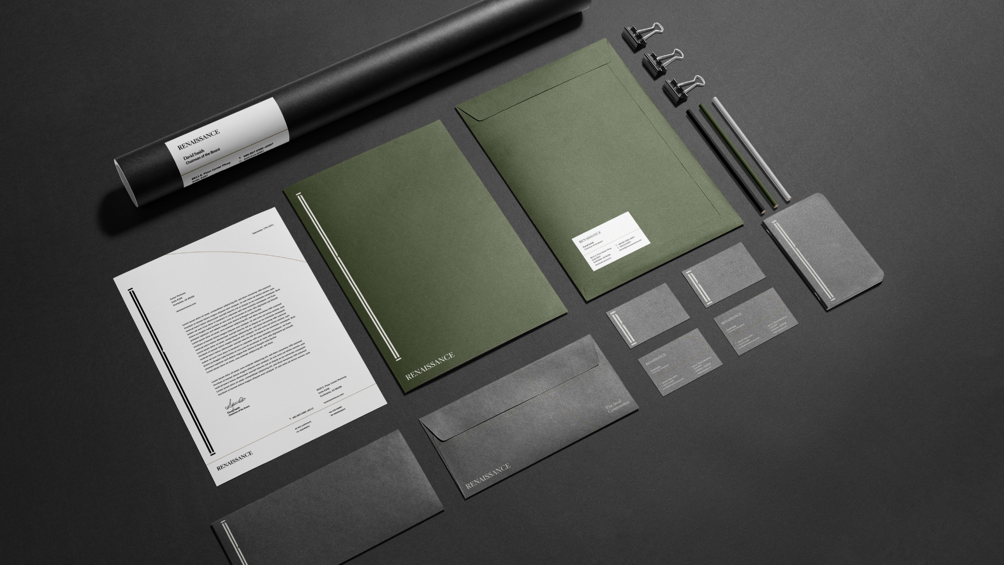
A multigenerational organization like Renaissance left no shortage of history and inspiration. With the amount of emotion and storytelling built into the identity of such a longstanding organization, our biggest goal for this identity was to create something new and awe-inspiring while also honoring the legacy of its late founder.
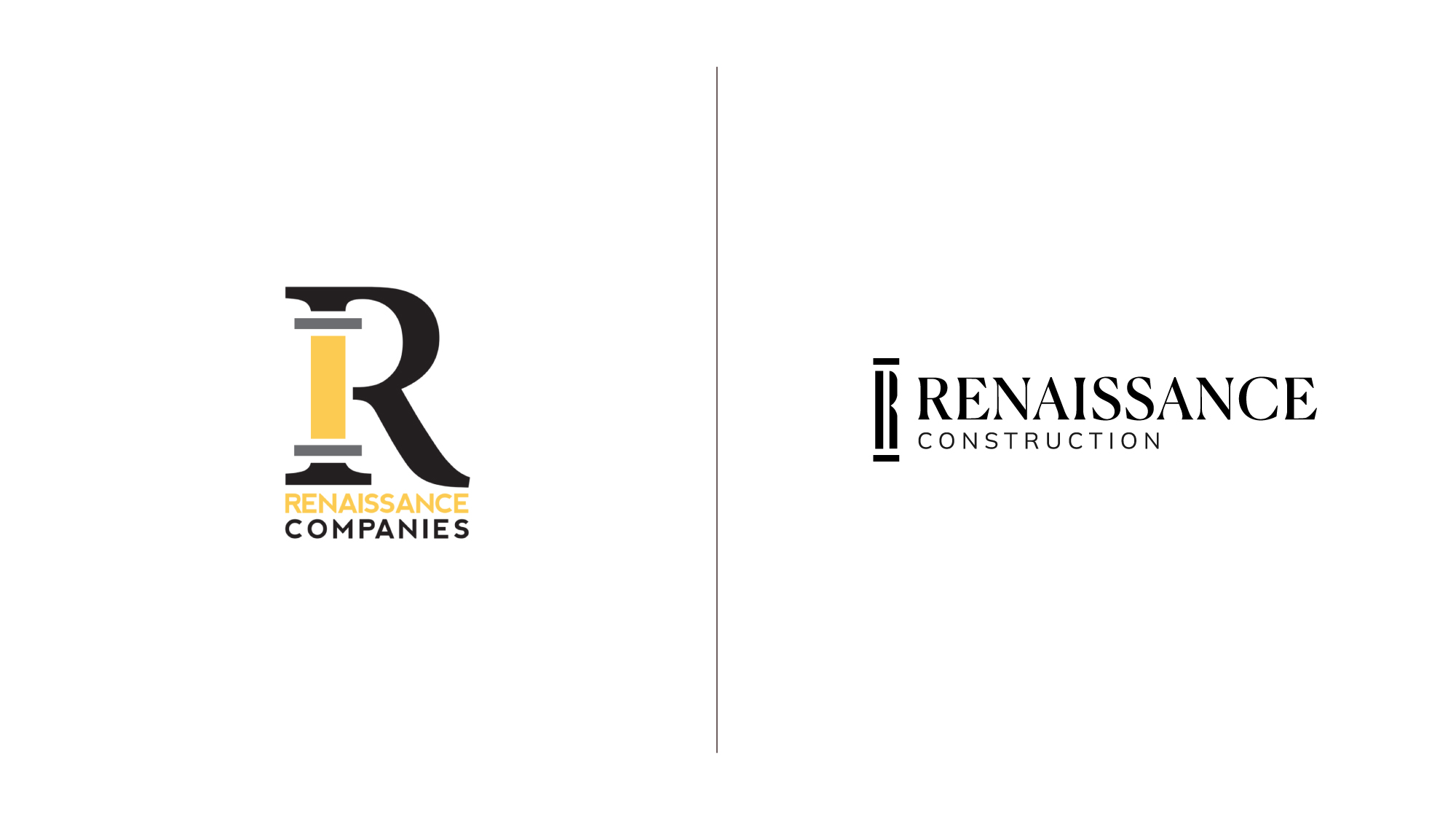
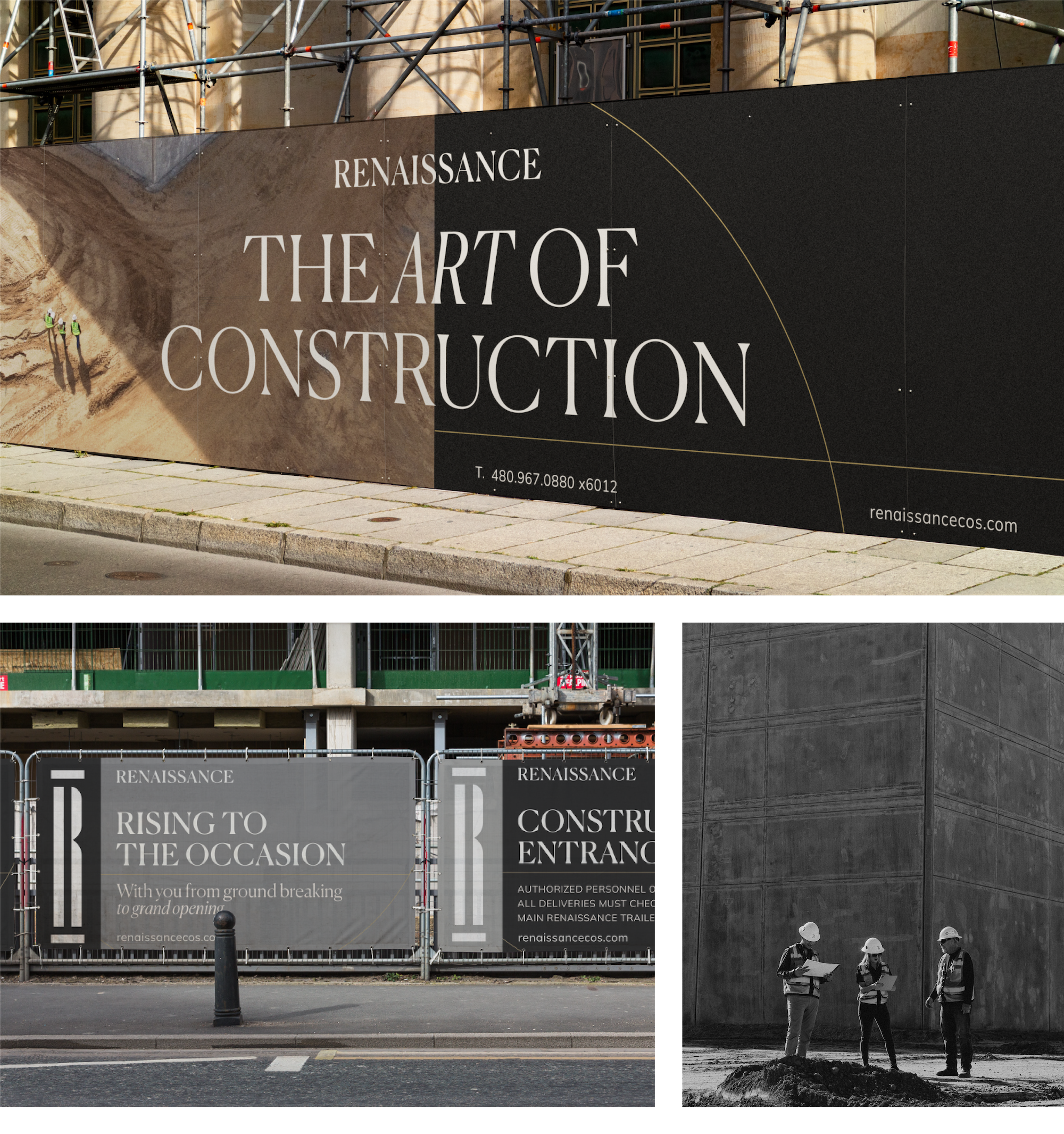
PILLARS OF EXCELLENCE LOGO
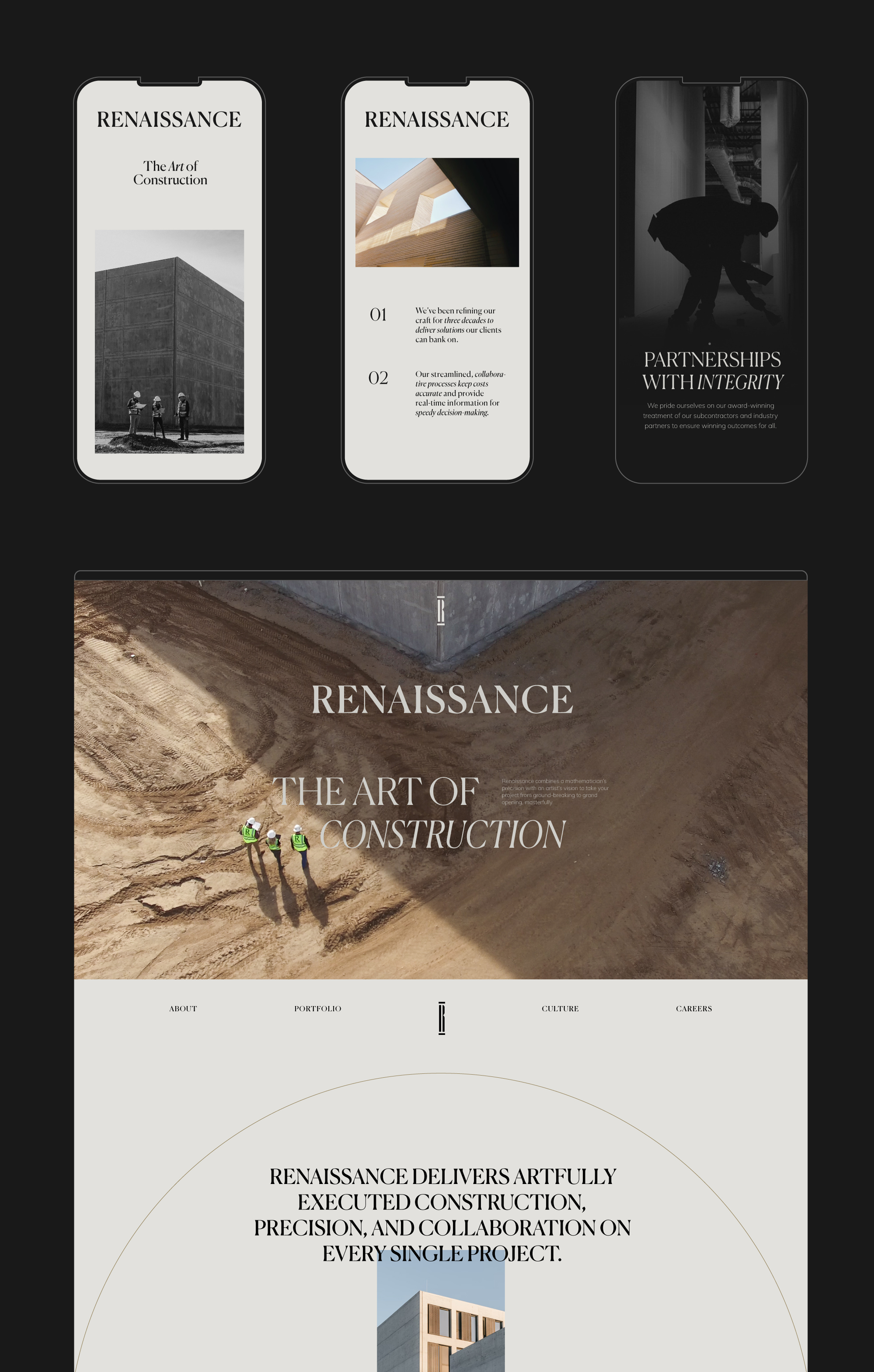
Renaissance boasts a keen ability to adapt to any job size or challenge. Inspired by their versatility, we reimagined their existing R monogram to be just as dynamic as their skills. The Pillar of Excellence logo was meticulously crafted to transform in accordance with the Golden Ratio – a nod to Renaissance’s “Gold Standard” positioning and commitment to rise to any occasion.
The new monogram was designed to stand alone or alongside the brand’s new wordmark – a customized variation of Canela.