Systematica | A Typeface
by Erik von Weber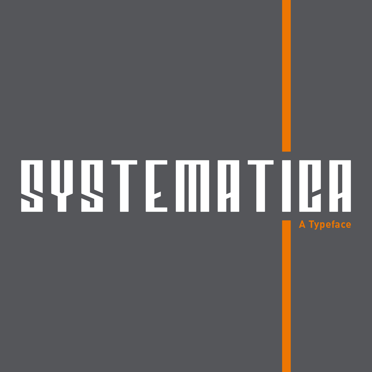
title
Systematica | A Typeface
agency
Headwerk
client
Personal Project
Submission by
Erik von Weber
Project Lead
Erik von Weber / Erik von Weber
Contributors
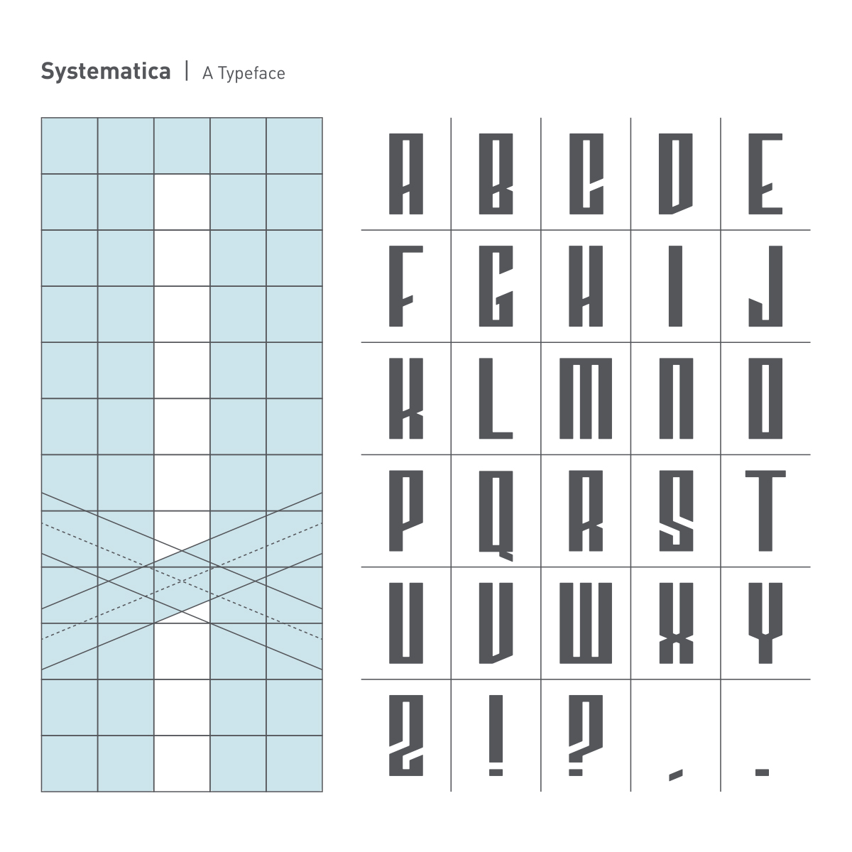
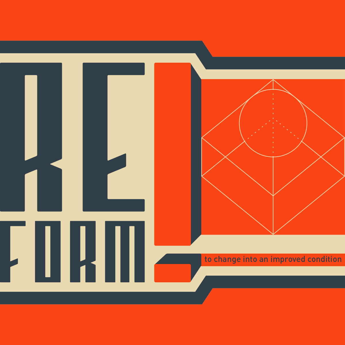
As a lover of typography, I'm fascinated by letterforms as a means of literal communication and visual expression. The design of Systematica was an exercise in geometry, symmetry and restraint. With a simple rectangle (the letter I) as the starting point, I created a rigid grid based on its measurements then used a mathematical approach to design each character. It was both challenging and rewarding to be expressive given the strict parameters I established for myself. The resulting typeface has elements of both Constructivist and Art Deco styles. I dig it.