Lift Lopes Up: Mental Health Campaign
by Paige Thomas
title
Lift Lopes Up: Mental Health Campaign
agency
GCU Student Ad Agency
client
GCU Student Affairs
Submission by
Paige Thomas
Project Lead
Denisse Montoya / Senior Graphic Designer
Contributors
Chad Wilson, Executive Creative Director Ele Fisher, Creative Director Diana Cheek, Art Director Emily Lane, Assistant Graphic Designer Rachel den Dulk, Assistant Graphic Designer Julianna Jordan, Assistant Graphic Designer Micah Fisher, Assistant Graphic Designer Arianna Bell, Assistant Copywriter Ireland Fleck, Assistant Copywriter Noah Fisher, Assistant Copywriter Lyric Jackson, Project Assistant
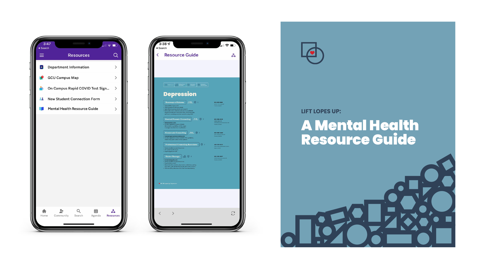
Following the difficult events of 2020, the GCE Student Ad Agency workers felt compelled to create a campaign to support mental health awareness for their friends and classmates at Grand Canyon University (GCU). The team decided to rework the current mental health resource guide to make it more visually appealing and the information easier to navigate.
The students developed many visual and messaging concepts and ultimately selected the campaign concept: Lift Lopes Up.
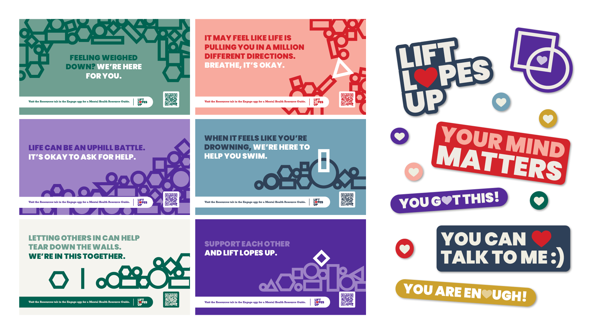
The Lift Lopes Up logo features a red heart inside an overlapping square and circle. The two shapes represent the diversity of the student body that we are all connected and care about one another. A modern color palette was selected to appeal to college students while complimenting and incorporating the iconic GCU purple. Warm and cool colors were included to convey complex emotions such as stress, anxiety, depression and loneliness.
The final guide included an uplifting welcome message written by the students for the students. They nodded to the GCU tagline: “Lopes Up.” It says: “If you’re here today, maybe you’re feeling Lopes down but we’re hoping to get you feeling Lopes up again.”
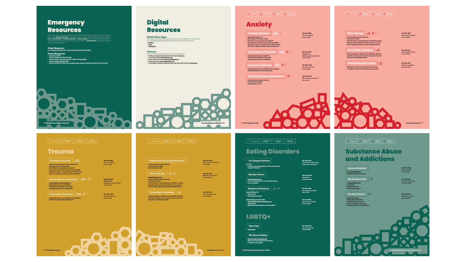
They created a helpful table of contents for better ease of use, listing critical emergency resources first. They also added categories by emotion and need, such as resources for those who identify as LBGTQ+.
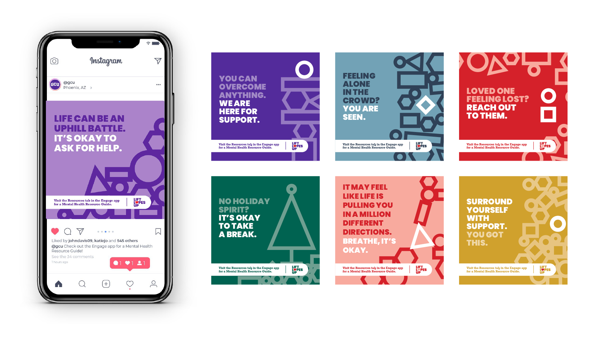
A promotional campaign for digital menu boards and social media was developed to support this new asset. Messages would be communicated throughout the year at times of greater need, such as the beginning of the school year, holidays and finals.
The students were uniquely positioned as the intended audience. They developed a striking concept and campaign considering what they might need as college students today.