You Had to Be There: An Insider’s Travel Guide to Arizona & Indiana
by Paige Thomas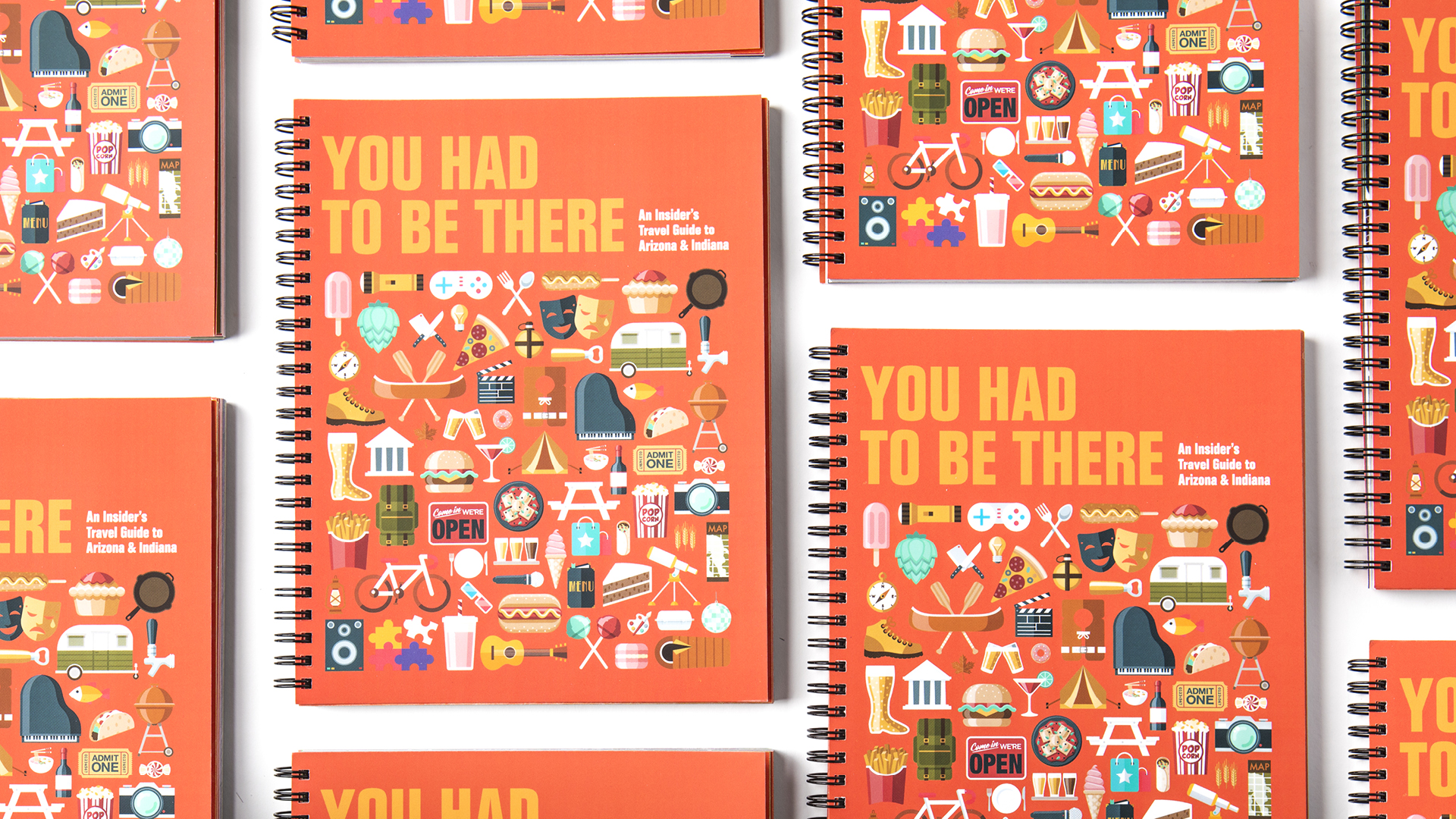
title
You Had to Be There: An Insider’s Travel Guide to Arizona & Indiana
agency
GCE Ad Agency
client
GCE Marketing Department
Submission by
Paige Thomas
Project Lead
Jason Boesel / Graphic Designer
Contributors
Chad Wilson, Executive Creative Director Ele Fisher, Creative Director Kristin Fisher, Art Director Diana Cheek, Art Director Brian Carbajal, Graphic Designer Maria Lance, Graphic Designer Denisse Montoya, Senior Graphic Designer Kyle Peterson, Junior Graphic Designer Jen Shibata, Graphic Designer Ursula Suszko, Graphic Designer Billie Worth, Graphic Designer Kaleigh Van Dam, Graphic Designer Rachel Den Dulk, Assistant Graphic Designer Micah Fischer, Assistant Graphic Designer Julie Jordan, Assistant Graphic Designer Emily Lane, Assistant Graphic Designer Jennifer Woods, Senior Copywriter Ashley Maish, Copywriter
Each year, the GCE Ad Agency allows the creative team to create a passion project – separate from client work – that inspires and connects designers and copywriters. It was only fitting then that this year they created something that joined our entire marketing department, which spans two states!
We decided on a travel guide with a fun, bold aesthetic that represented both states equally. The entire marketing department contributed content about each other’s favorite places to play, eat and have a good time. The biggest challenge of this project was bringing dozens of voices and creative minds together in a cohesive manner.
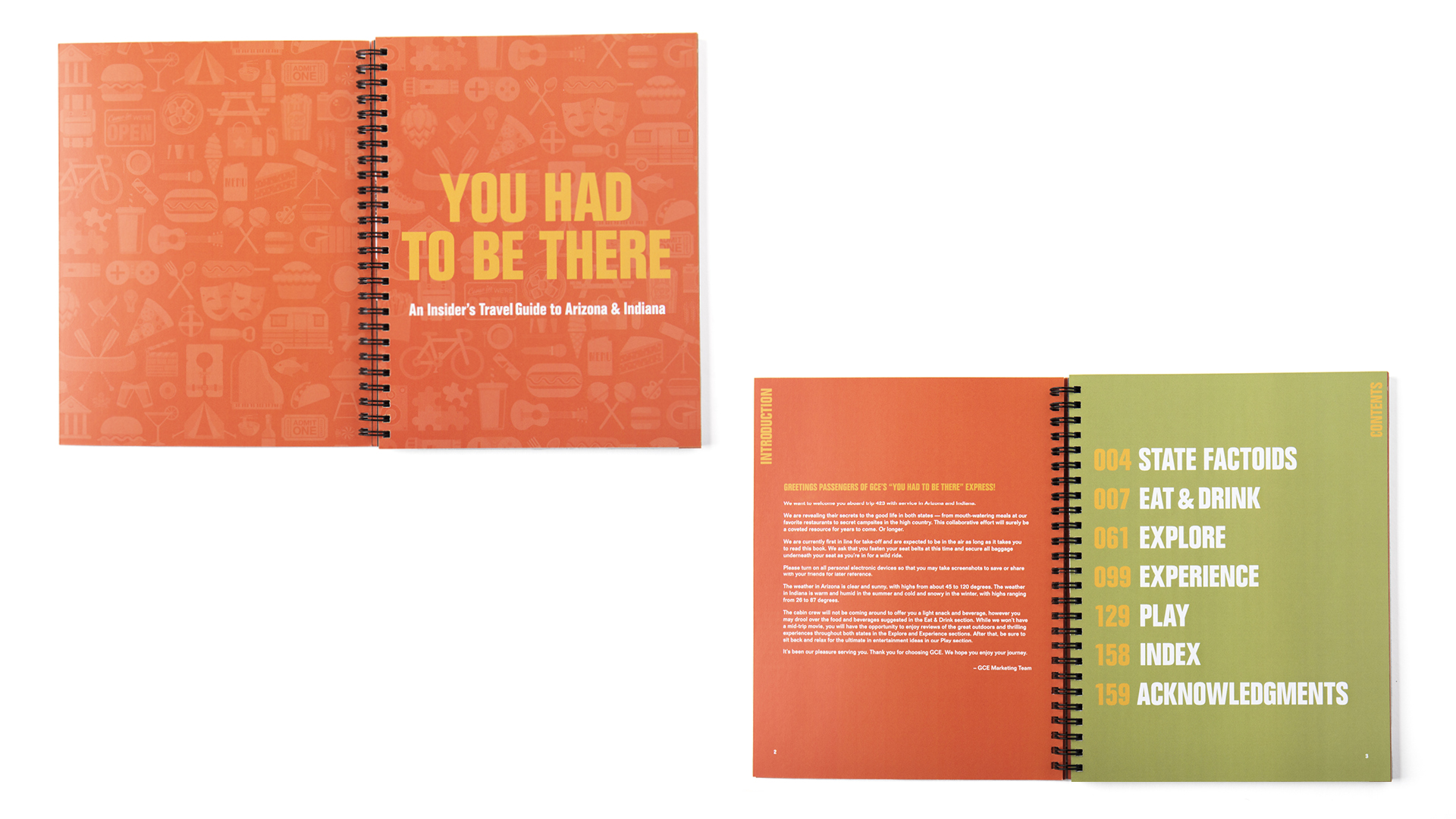
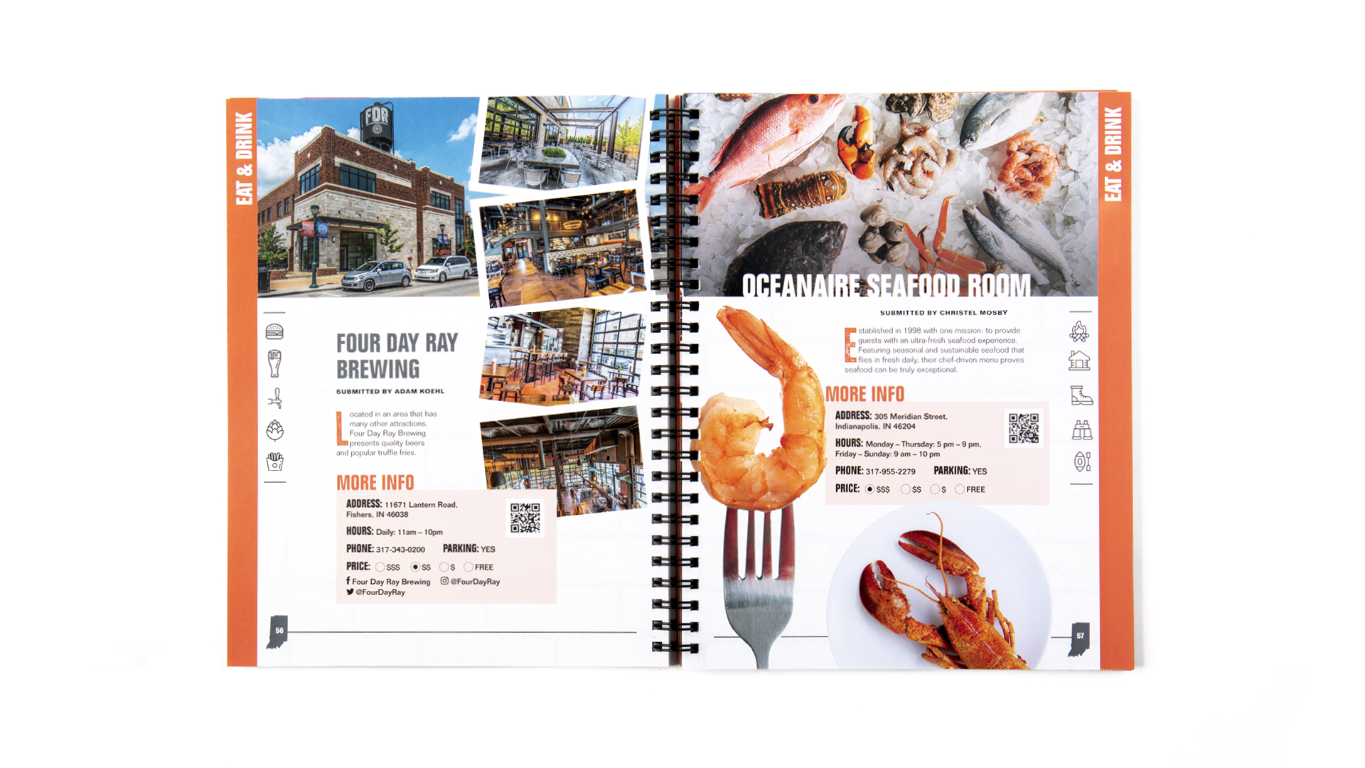
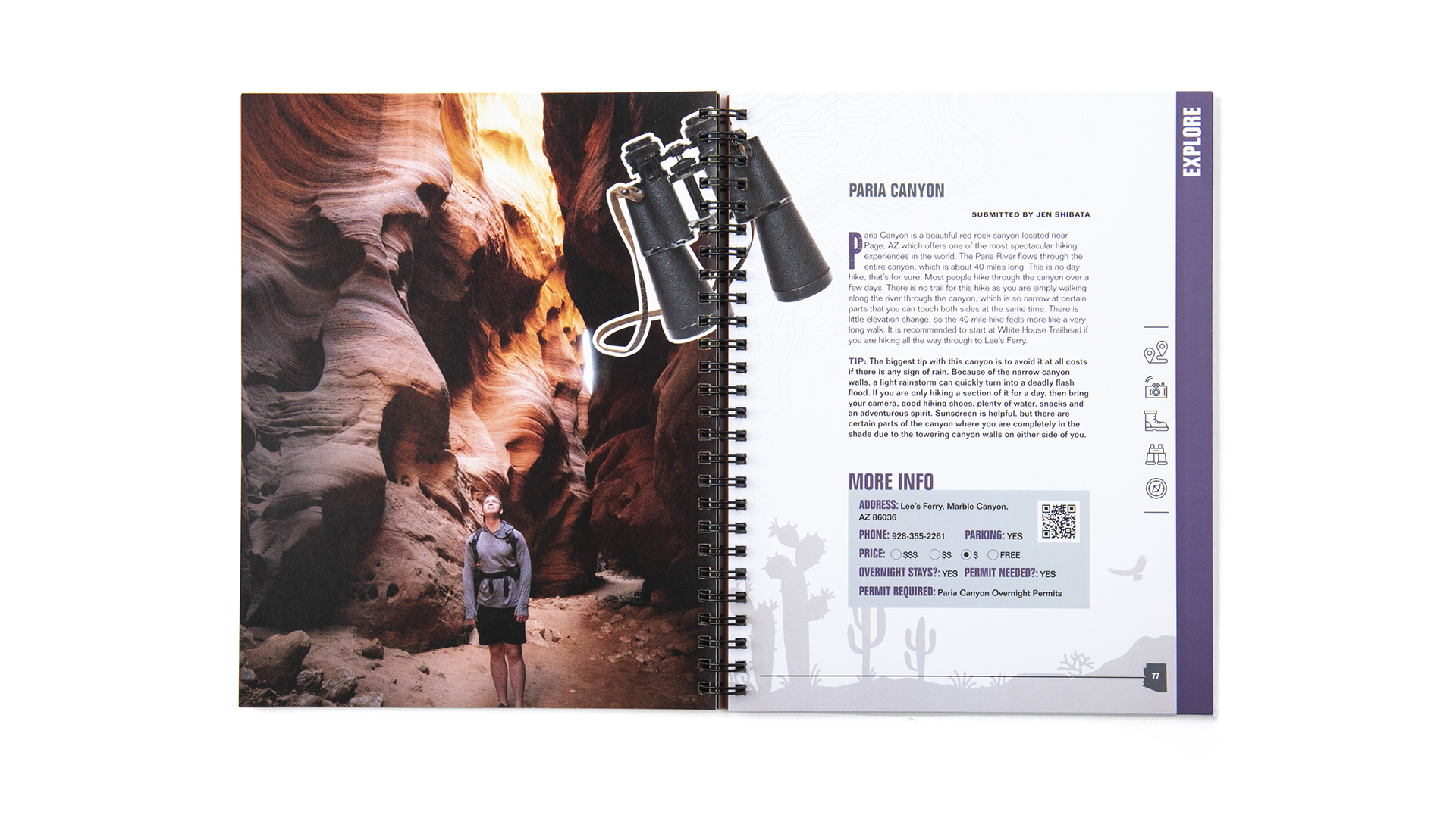
Each of the four distinct sections (“eat and drink,” “explore,” “experience,” and “play”) was paired with a distinct color (orange, purple, green and blue with gold accents). Inside each section, the content pages had a modulated layout with a hierarchy of content that let each designer use their imagination to best represent the information inside.
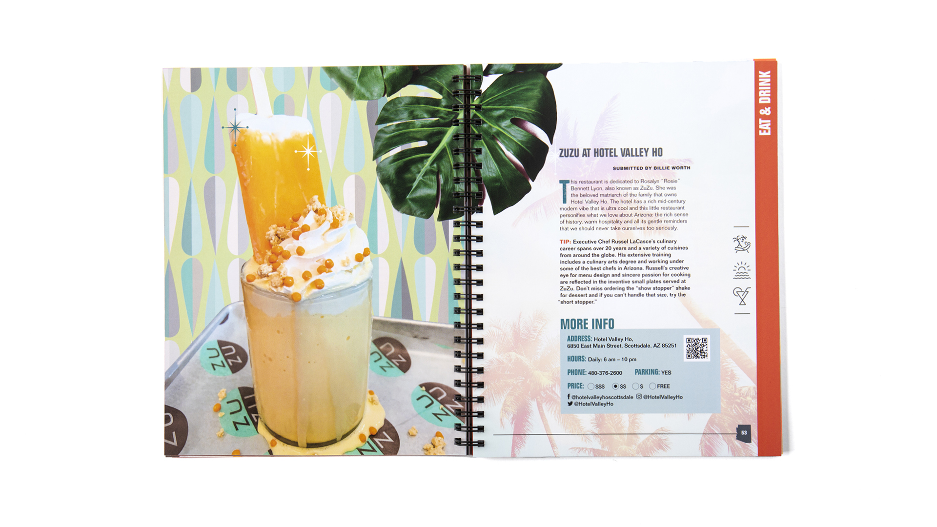
The book's overall design was inspired by art books filled with logos and travel guide icons. The designers created monoline-style icons that were arranged for the inside cover pages and used as the main cover art. The cover icons were chosen to fit the narrative of the book. For example, a camper for campgrounds, pizza for restaurants, puzzles for an escape room, bike for a bike tour — every icon on the front relates to the content found inside the book.
The team loved learning about each other and seeing their picks illustrated through this holiday gift. We wanted a rugged style that opened flat and used heavier paper so we could toss the book in our car (or bag) to take with us, use it often and serve as a keepsake of our teamwork.