Isometric Sans
by Micah Fischer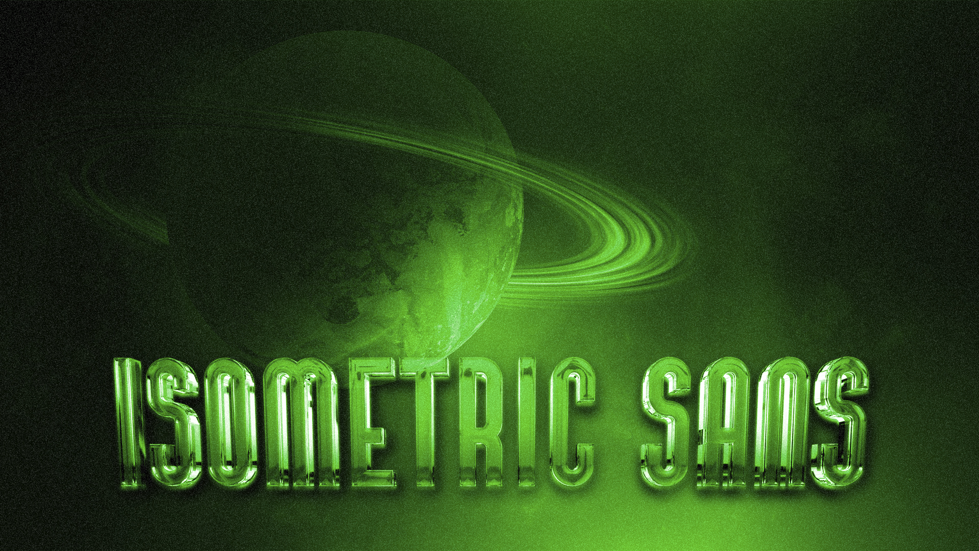
title
Isometric Sans
agency
Micah Fischer
client
Passion Project
Submission by
Micah Fischer
Project Lead
Denisse Montoya / Project Lead
Contributors
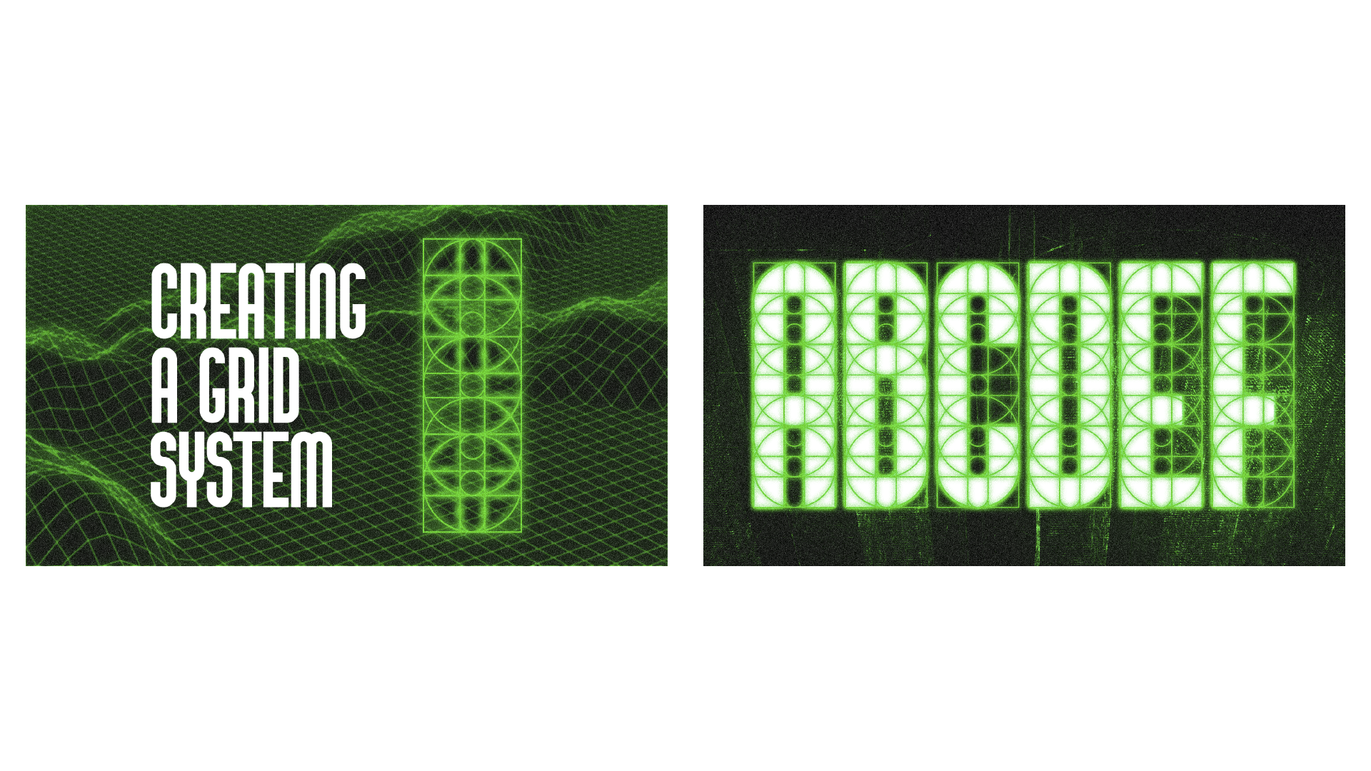
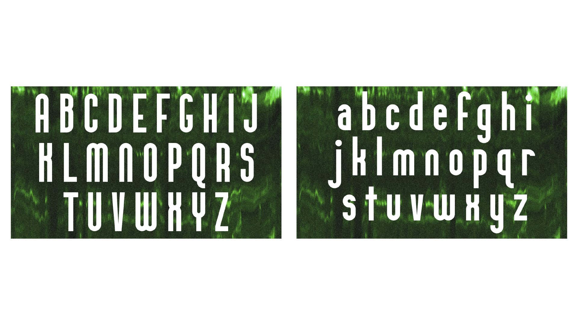
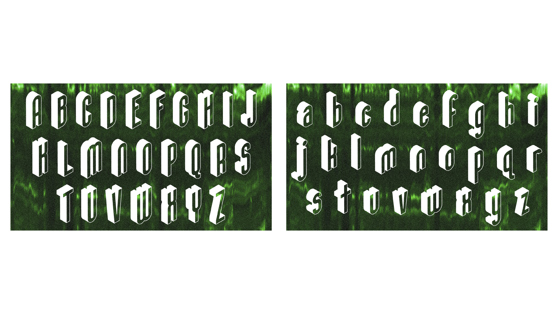
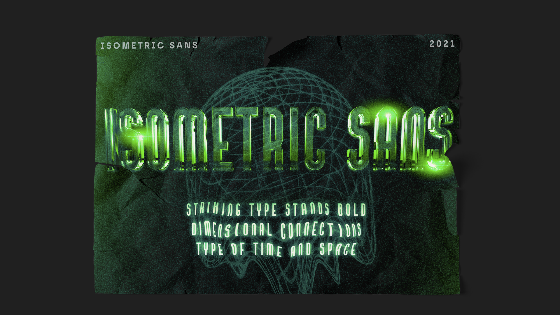
My goal when designing Isometric Sans was to develop an isometric typeface that would function well in a variety of use cases. While there are plenty of isometric typefaces available, many are heavily stylized or built out of blocky shapes that make them awkward to use across a wide variety of designs. I built my typeface two-dimensionally first and focused on developing a grid system that would allow me to create consistent letterforms that still maintained an organic look and had natural curves. The most challenging process was converting 2D letterforms into 3D space and establishing a grounding plane for the letters to sit on. In the end, I developed a typeface that was versatile, unique, and fun.

Micah Fischer
Over the last year, I settled into my first design job and finished out my freshman year as a graphic and web design student. I took on my first freelance website project and learned a ton from the process. This past year was full of big steps for me professionally, and I forced myself to try new things, like designing a typeface for the first time. I also transitioned into the role of a Web Designer and started focusing on my dream career path. Even though life was a little more challenging this past year, I was blessed with some incredible opportunities.