Kaizen
by Miles McDermott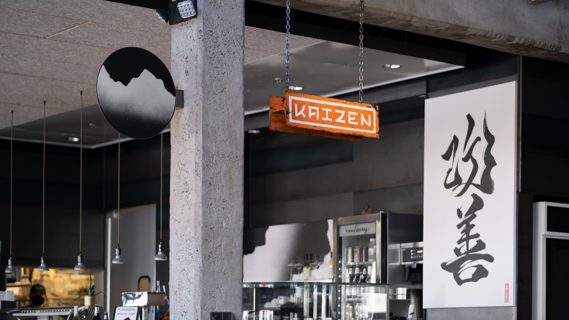
title
Kaizen
agency
Moses Inc
client
Conceptually Social
Submission by
Miles McDermott
Project Lead
Miles Willis McDermott / Art Director
Contributors
Matt Fischer, Sign Painting Sonya, Welder
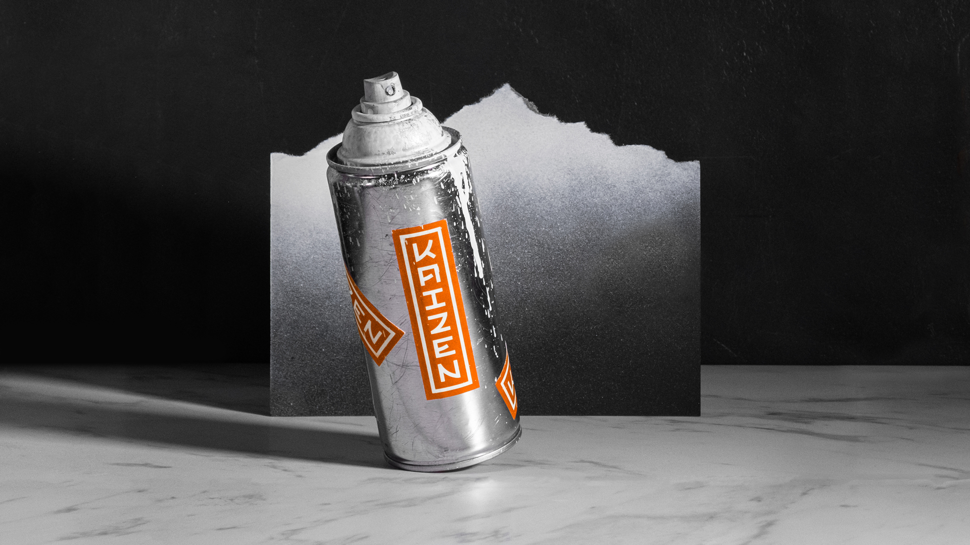
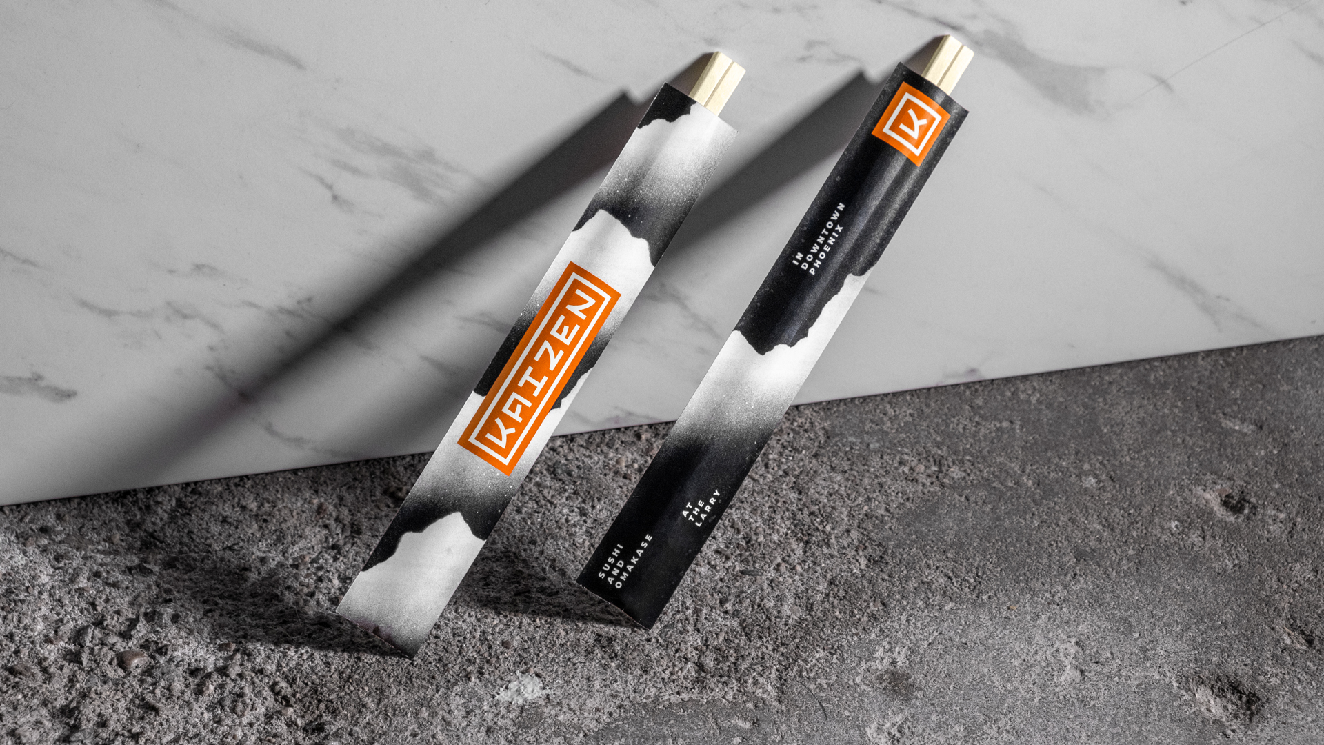
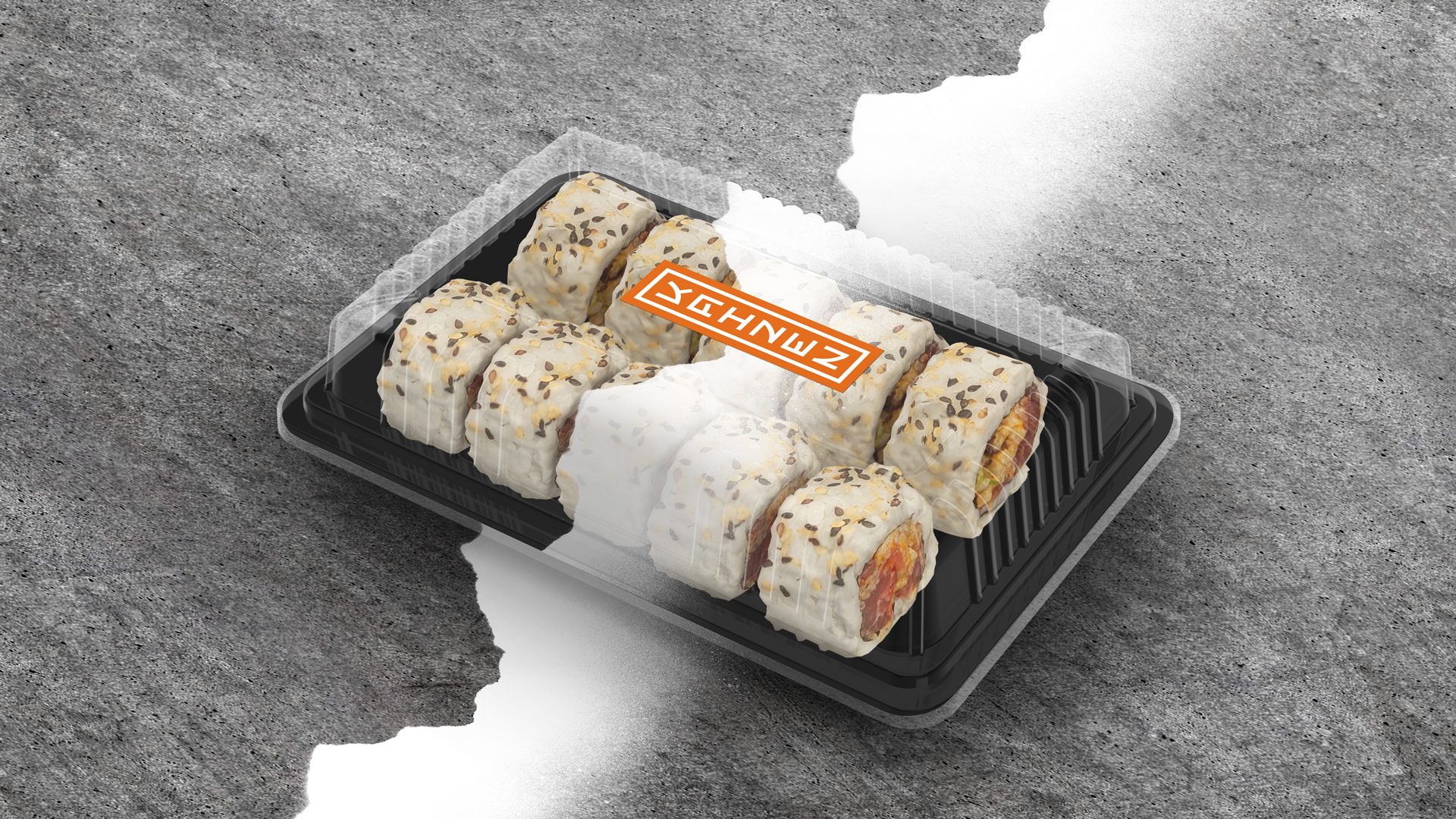
Kaizen is a high end sushi and omakase restaurant inside the historic 1926 Lawrence building of Downtown Phoenix's Warehouse District. Taking inspiration from the ombré mountains found in traditional Japanese Ukiyo-e artworks, torn paper and spray paint were used to create stencils of unique and iconic landscapes–A perfect marriage of Japanese and Downtown Phoenix culture.
The logo was inspired by blocky Japanese Hanko signature stamps, featuring custom lettered typography that shares the same architecture as Japanese Katakana characters.
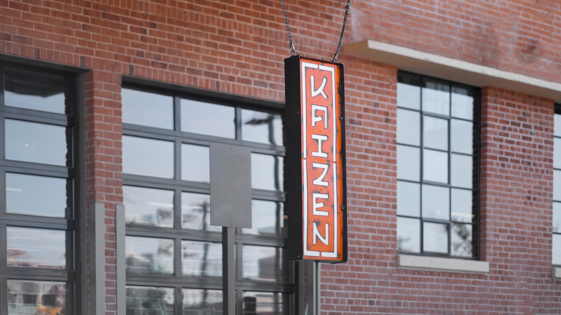
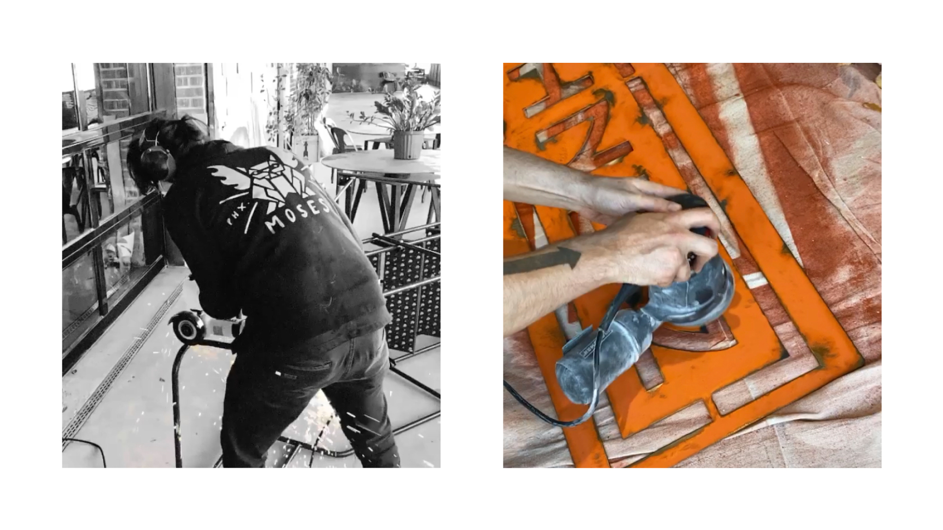
Even though it was renovated and modernized, the Lawrence Building still retains its original orange i-beams. To pay homage to the space and further unite the branding and the building, we created a replica of the steel i-beams and hand painted and lettered the logo onto it as a hanging sign for the interior. We used grinders and patina chemicals to roughen the paint of the metal sign to give it the same appearance as the century old i-beams next to it. This same process was used when creating their fully custom exterior sign. There were extreme budget limitations, so our agency designed, blueprinted and fabricated the sign with help from a local welder.
The client made an effort to "let us do our thing" throughout the branding process and they constantly tell us how glad they are that they did. The project has gotten a great deal of attention and we still overhear customers mentioning the immense cohesion of the branding with the space and how it creates the perfect vibe. Being able to help a small local restaurant open in the midst history's worst time for restaurants and seeing them flourish has been an incredibly rewarding experience for our entire tea m. The project went on to take second place for Logo Design in the National American Advertising Awards.
Miles McDermott
While the world of advertising and marketing can leave a bitter taste in someone's mouth, we can't shrug off the impact our hard work has on the lives of the hard working small business owners. It's extremely rewarding to see the contrast between how your client talks about their rough idea for a business at the beginning of a project and how your client boasts about their fresh-as-f*ck established business at the end of the project. The unity of two incredibly different hard workers coming together to create something badass is why I love my job.