Organic Vines Branding
by Steffan Stewart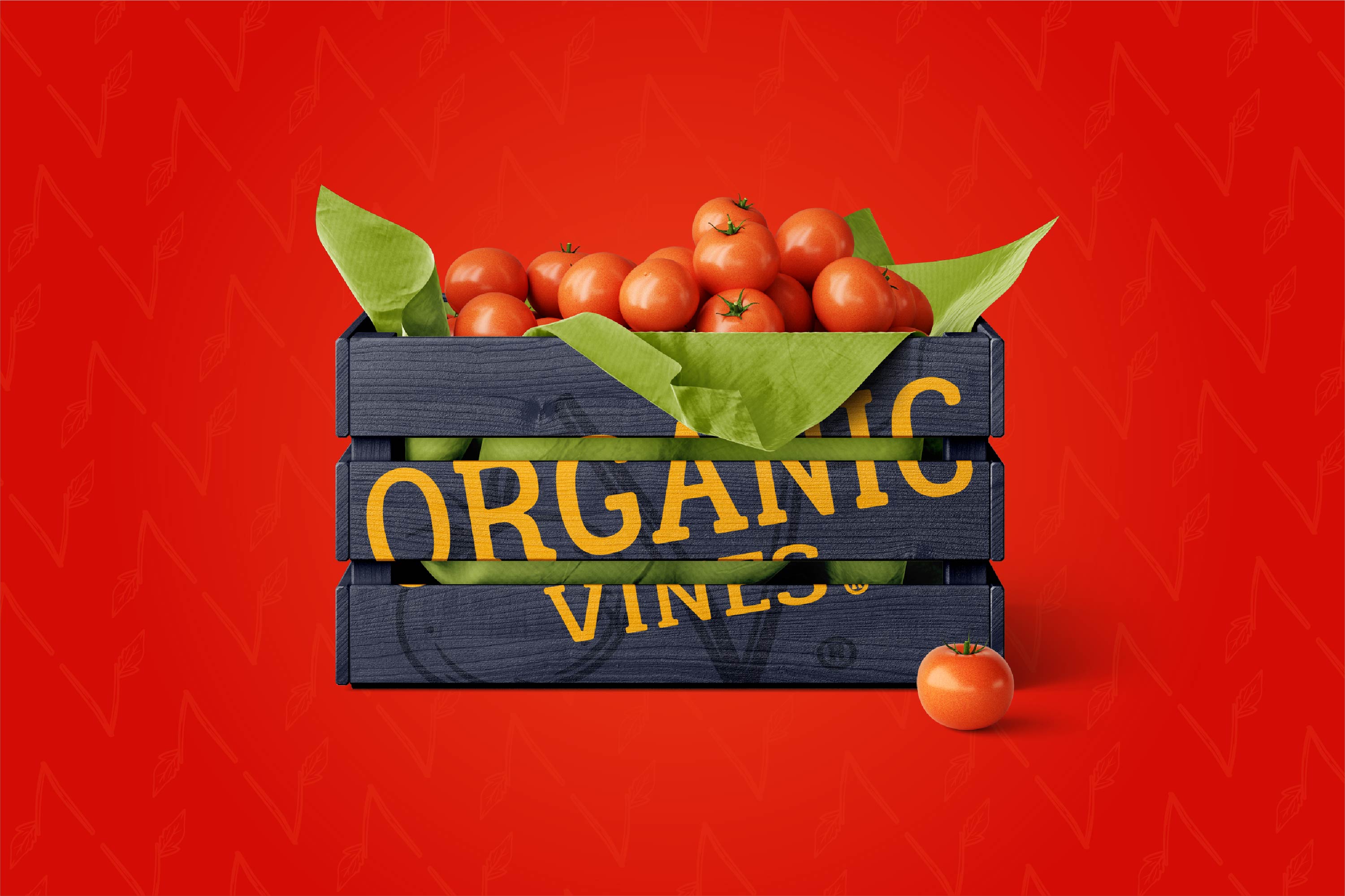
title
Organic Vines Branding
agency
Bridge
client
Organic Vines
Submission by
Steffan Stewart
Project Lead
Steffan Stewart / Colton Barry
Contributors
Steffan Stewart, Creative Direction / Brand Strategy / Visual Identity Design Colton Barry, Creative Direction / UX/UI Design / Website Development
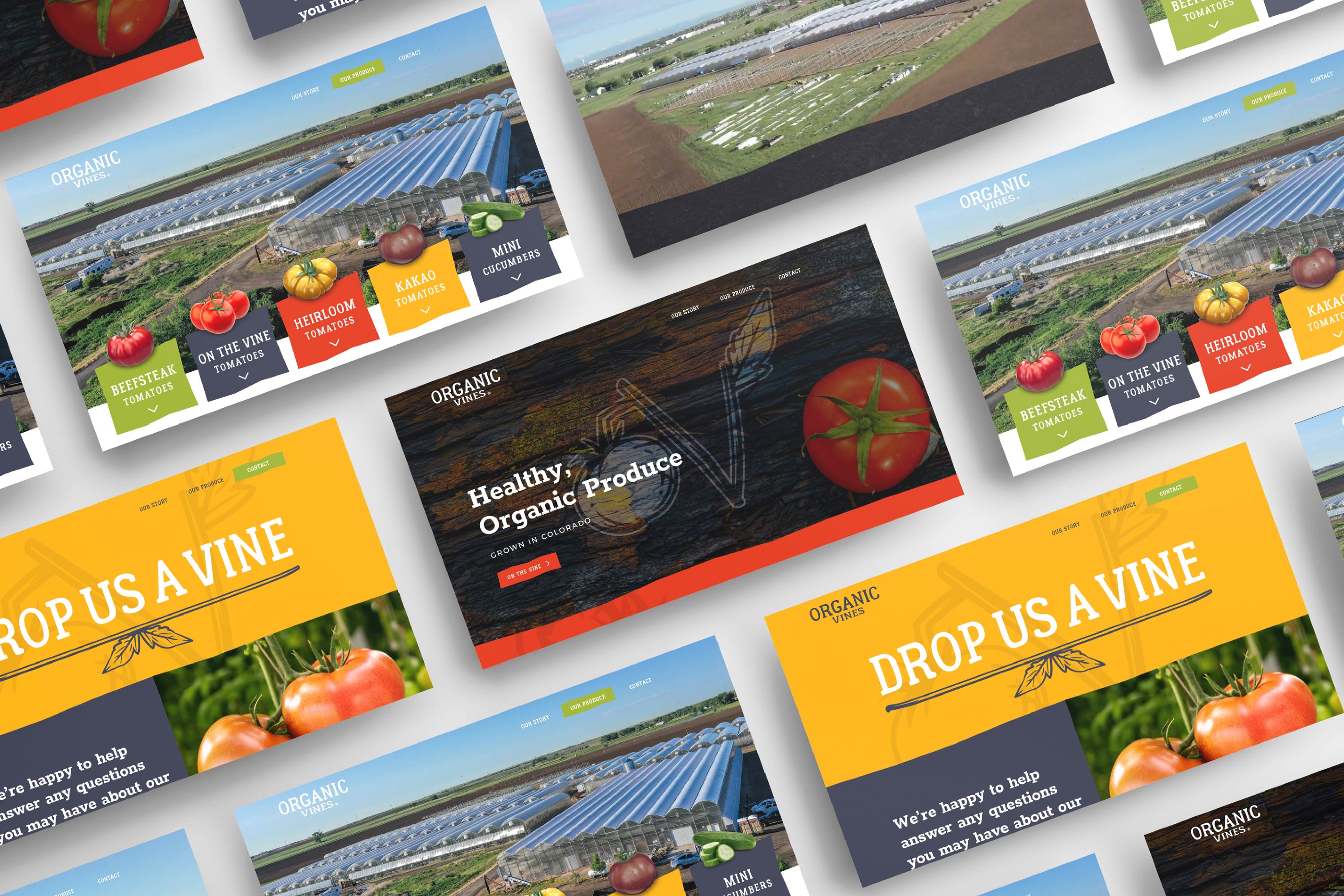
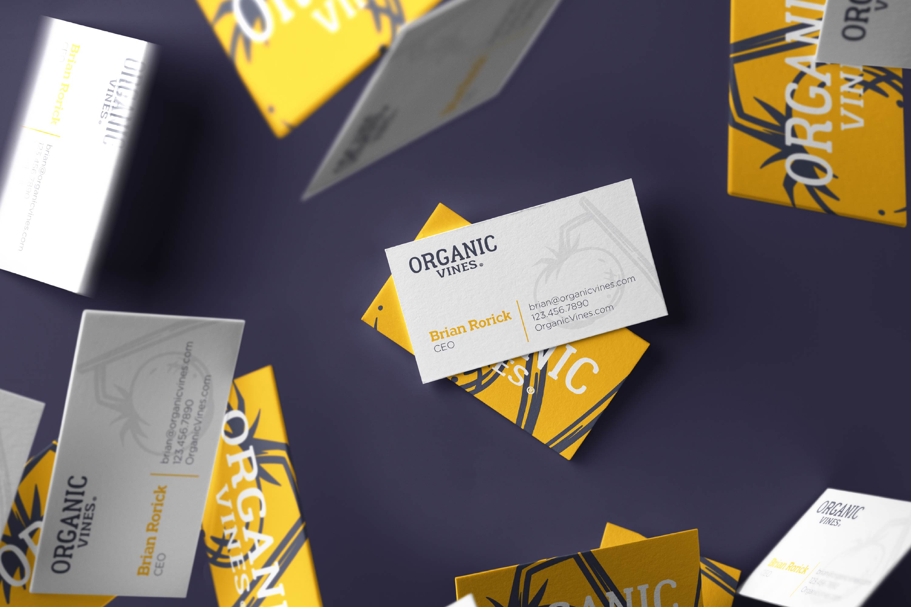
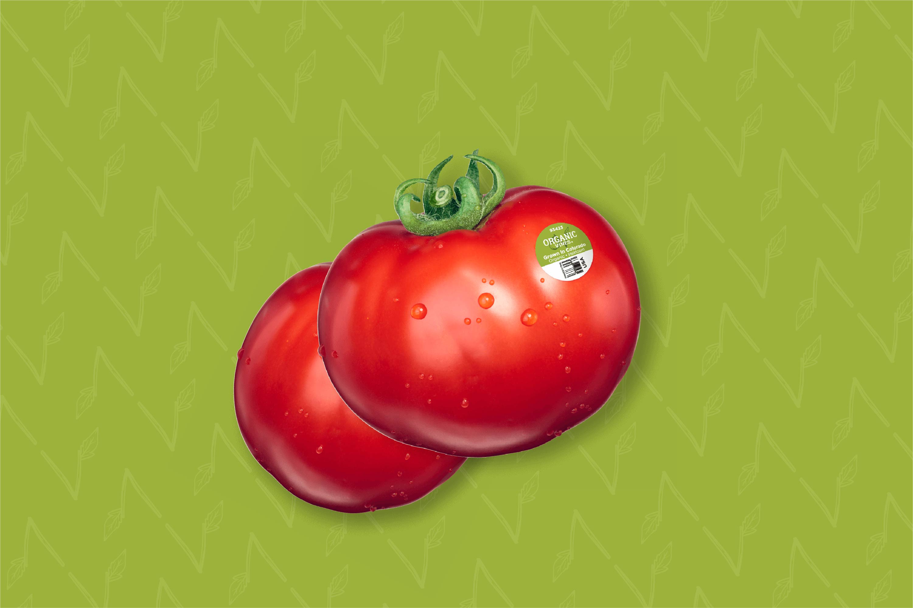
Organic Vines wanted to bring a modern touch to their dated brand, while evoking the organic appeal that their produce embodies. When building the visual identity and brand, this was where we placed our primary focus.
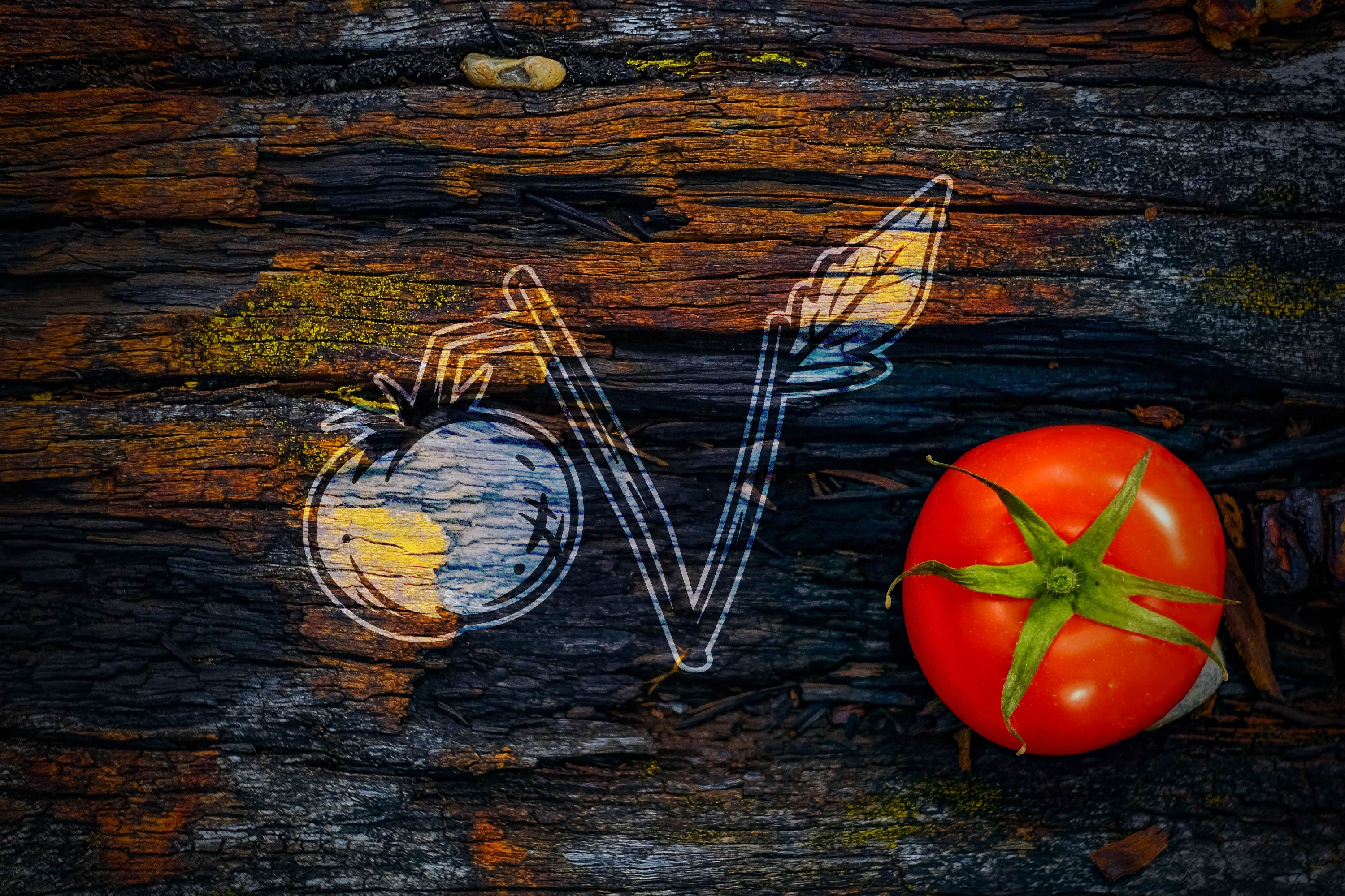
The final mark is illustrative in style to embrace this hand-crafted tone. The mark creates a subtle “O” and “V” in the tomato and the vine, itself; the sprouting leaf is a nod to the concept of nature/ naturally grown, more specifically being a symbol for life and growth. We also utilized a color palette that is inclusive of the Colorado colors, along with fresh greens for natural appeal. The Organic Vines team loved the direction and we couldn’t be happier, ourselves!

Steffan Stewart
2020 certainly hasn't been without its complications. Just as with may other businesses, creative or otherwise, it has of course made things difficult to navigate. Despite this, we've pushed through and worked on some amazing projects with amazing people! We've won a handful of awards this year for our work, and while it's a huge win for us, these awards are for the Arizona Design Community as a whole. While cities like LA, NYC, Portland, etc. are designer destinations, it's important to us that Phoenix/AZ is on the map. Some of the most amazing creatives on the planet live in this very state and we'd like that message to be heard loud and clear - we hope these small wins help to amplify that message and make Arizona the destination state for creators of all walks.