Harvest Pillar Branding
by Ryan Lowry
title
Harvest Pillar Branding
agency
Ideas Collide
client
Harvest Pillar
Submission by
Ryan Lowry
Project Lead
Nick Winter / Art Director
Contributors
Amy Frost, Creative Director Emily Cheng, Project Manager
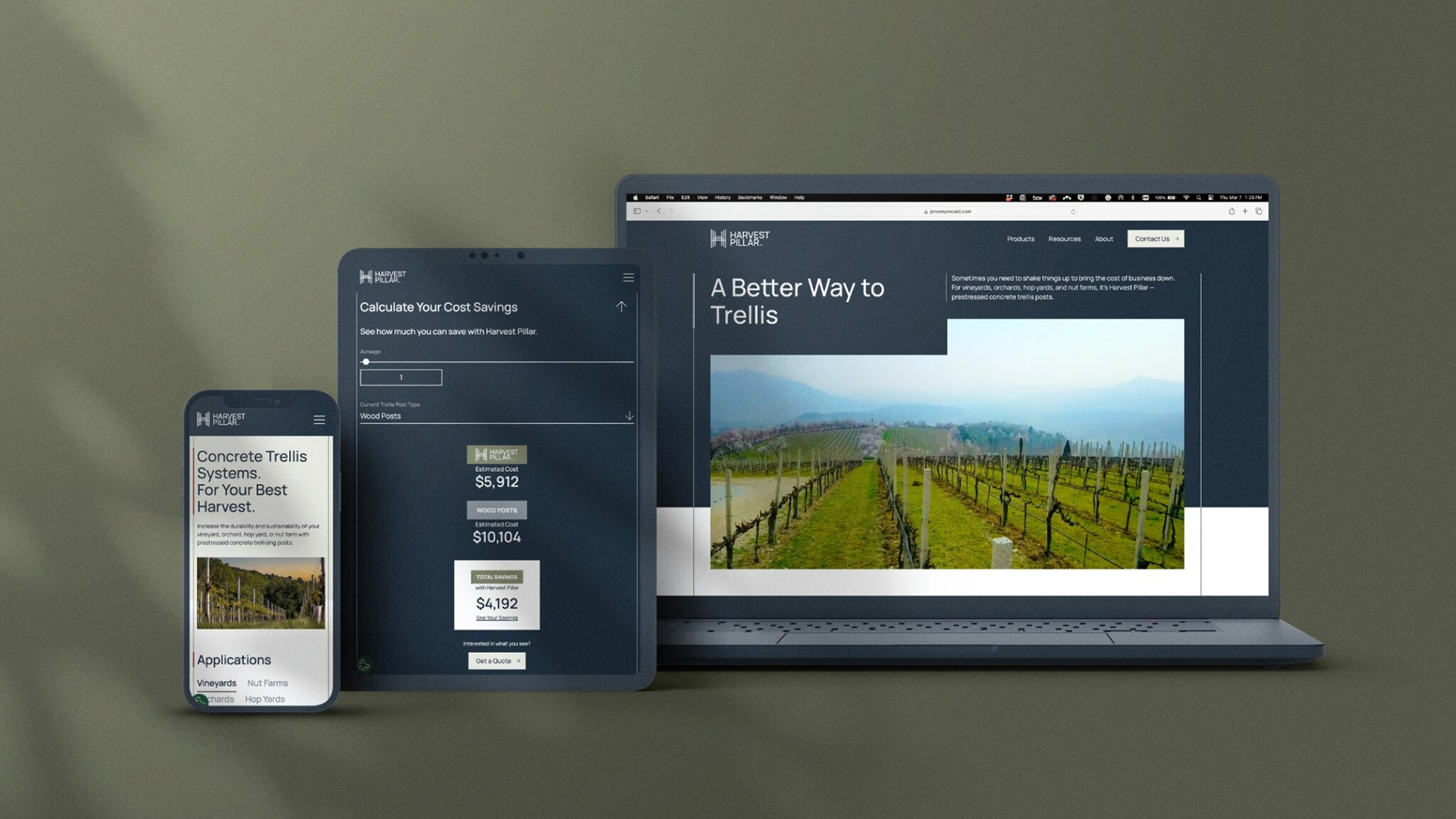
Ideas Collide partnered with Harvest Pillar, a sub-brand of Jensen Precast, to develop a robust brand identity and new website. This was done in an effort to position Harvest Pillar as a durable trellis solution—backed by its creator’s half-century legacy.
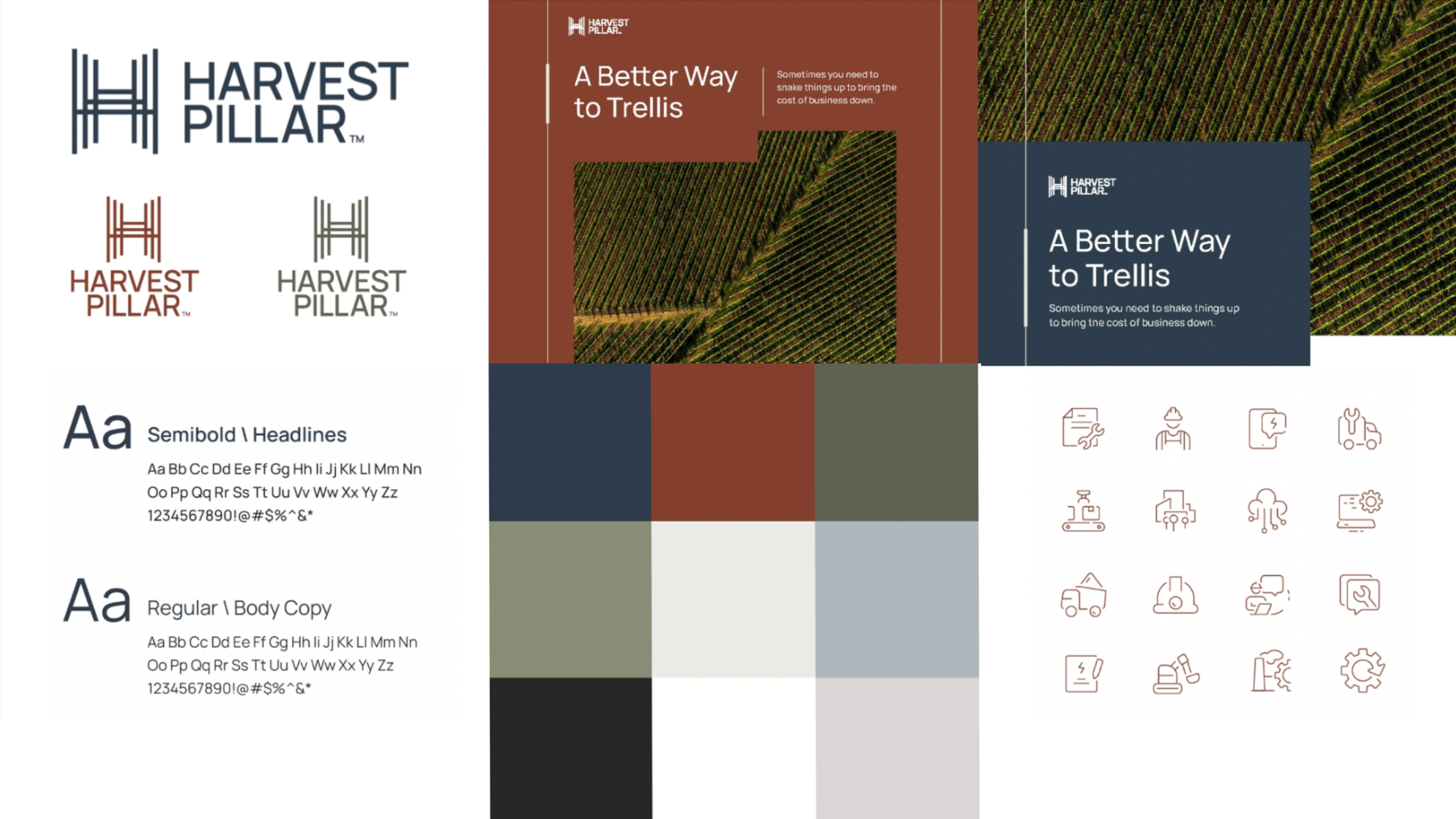
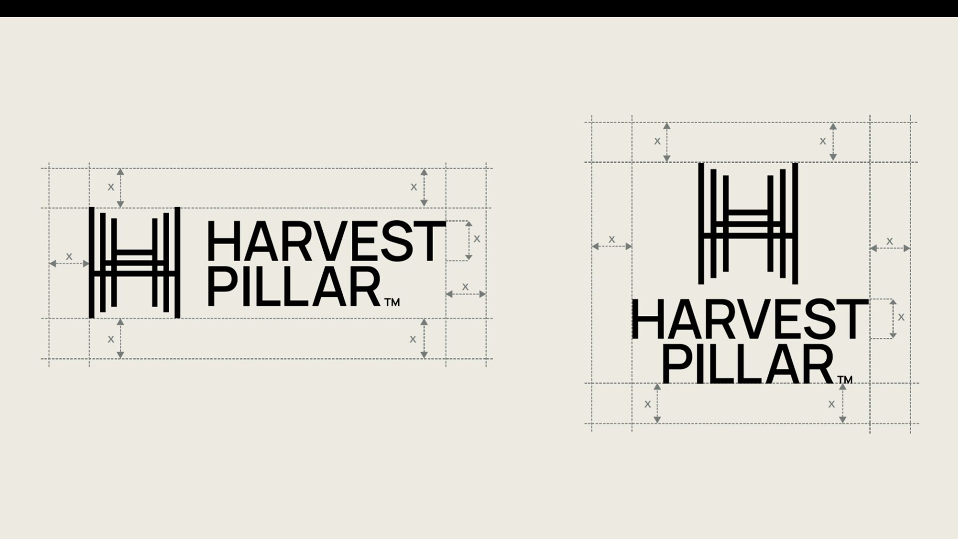
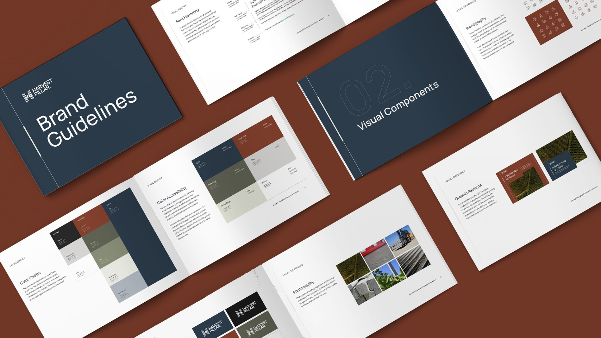
Logos matter. And we knew that Harvest Pillar’s logo had enormous potential to communicate innovation and establish credibility in a competitive landscape. To that end, we developed an eye-catching logo that cleverly incorporated the product itself, and helped the brand resonate with diverse audiences. Our design team started by building out a mood board representing Harvest Pillar’s durability and forward-thinking approach, as well as its connection to the agricultural sector.
Colors and typography were carefully considered to evoke trust, reliability, and alignment with farming’s natural elements. The resulting logo — three uppercase H’s overlaid to resemble a row of trellises — visually embodies Harvest Pillar’s name, its values, and its product. This became a key pillar establishing brand presence in the agricultural market.