The Sankofa Project: Symbols, Colors, and Purpose
by Patience Walton
title
The Sankofa Project: Symbols, Colors, and Purpose
agency
DG Premier Design Studio
client
James Holly - University of Michigan
Submission by
Patience Walton
Project Lead
Patience Walton / Creative Director
Contributors
Purpose:
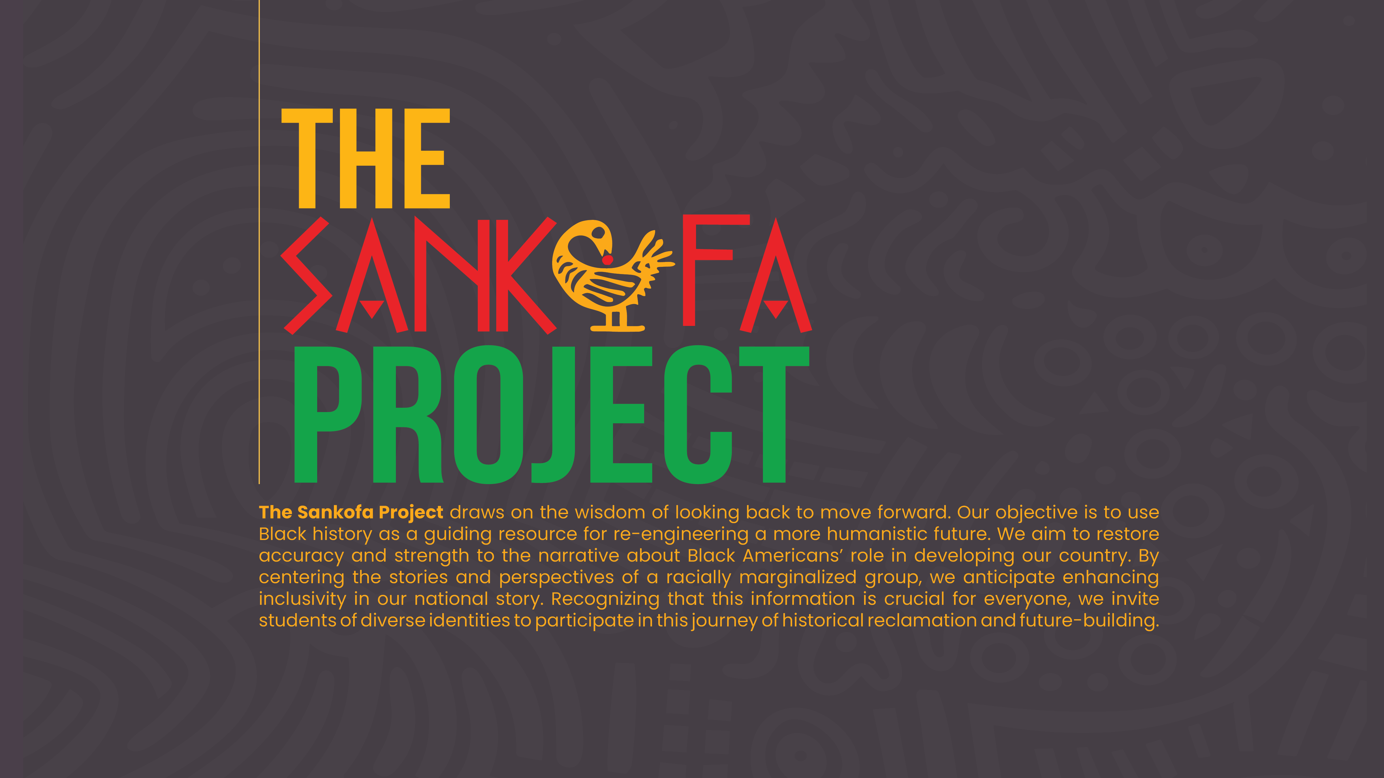
The Sankofa Project aims to create socially conscious engineers at the University of Michigan by using African American history as a guiding resource for re-engineering a more humanistic future. Our goal is to restore accuracy and strength to the narrative about African Americans' role in developing our country's engineering and technological landscape.
Solution:
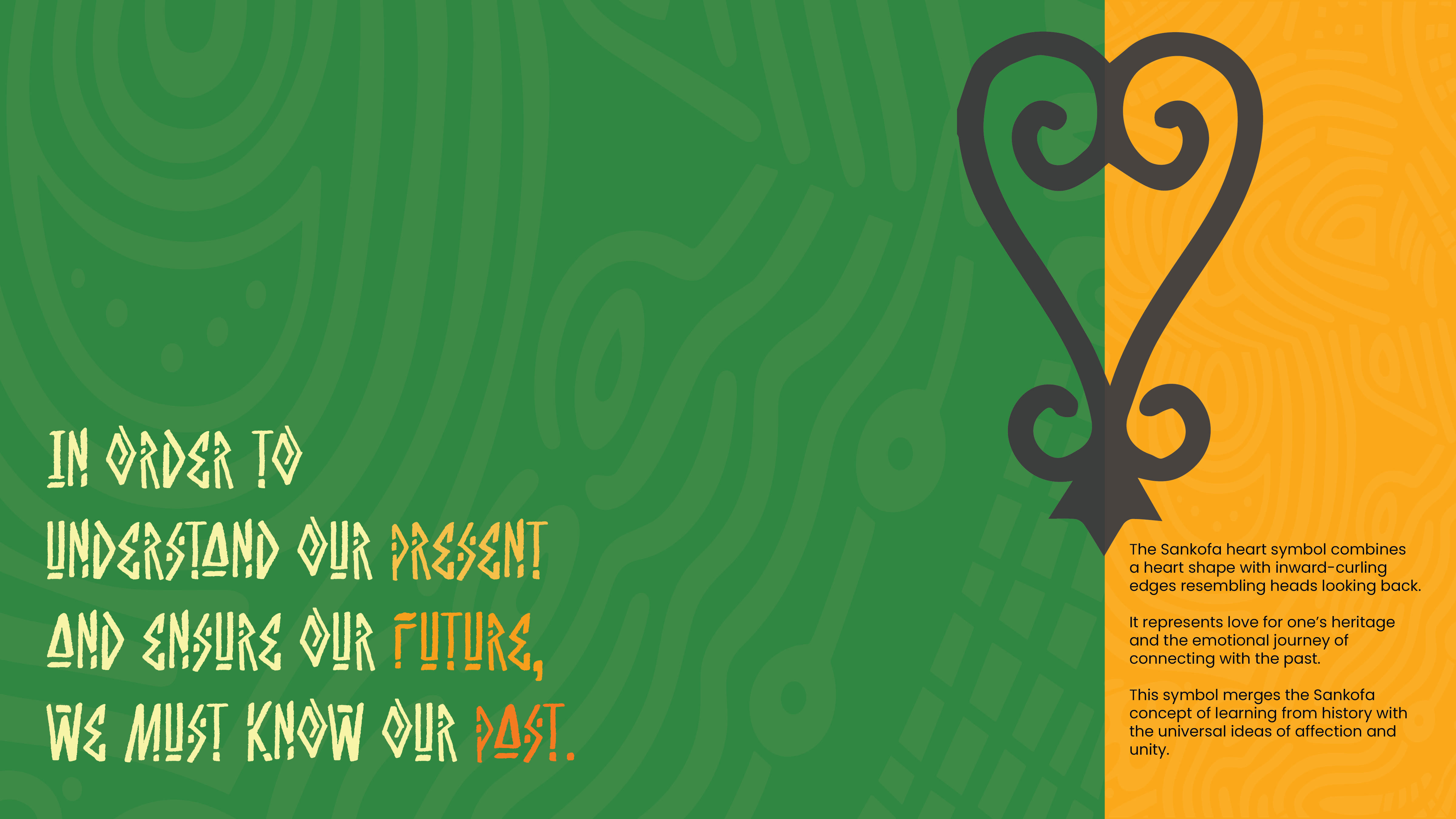
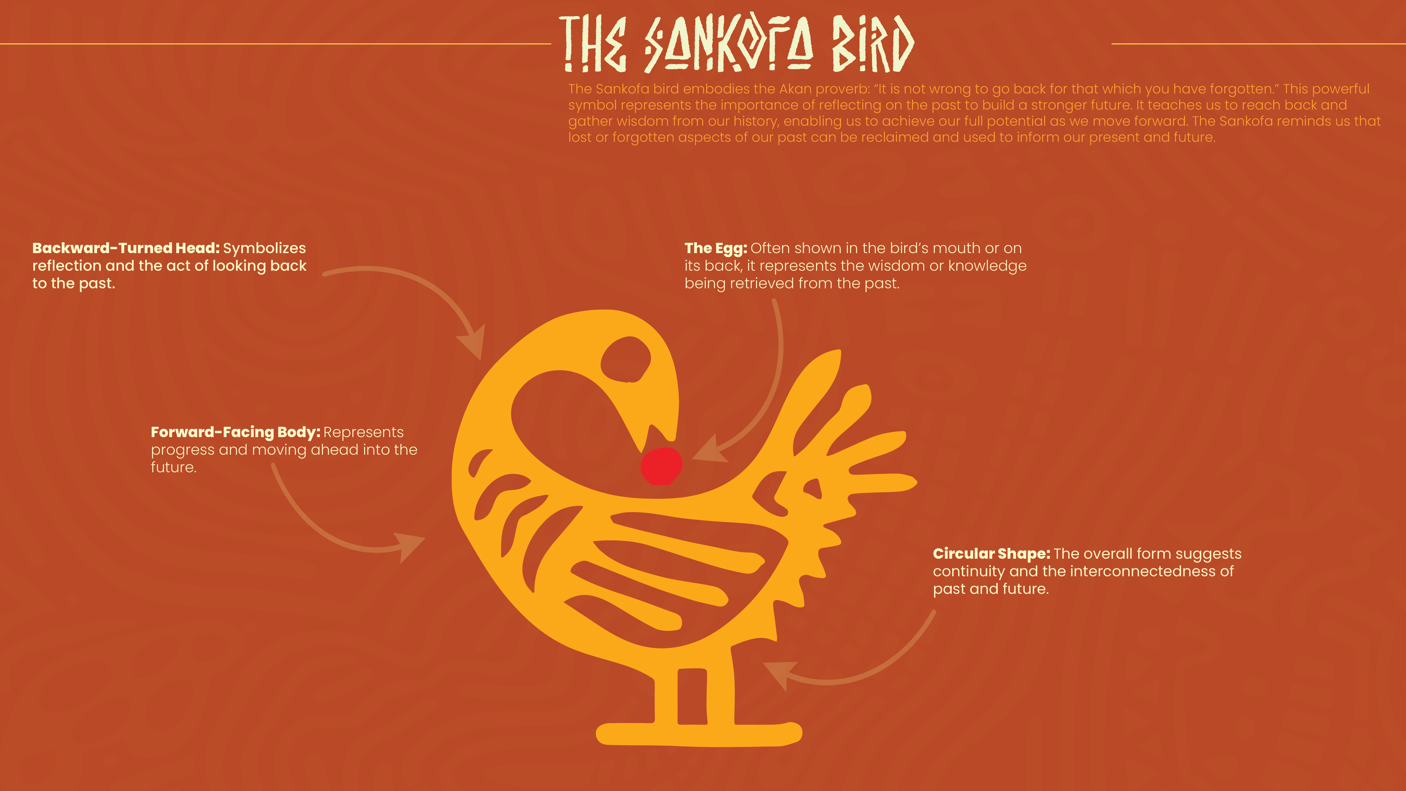
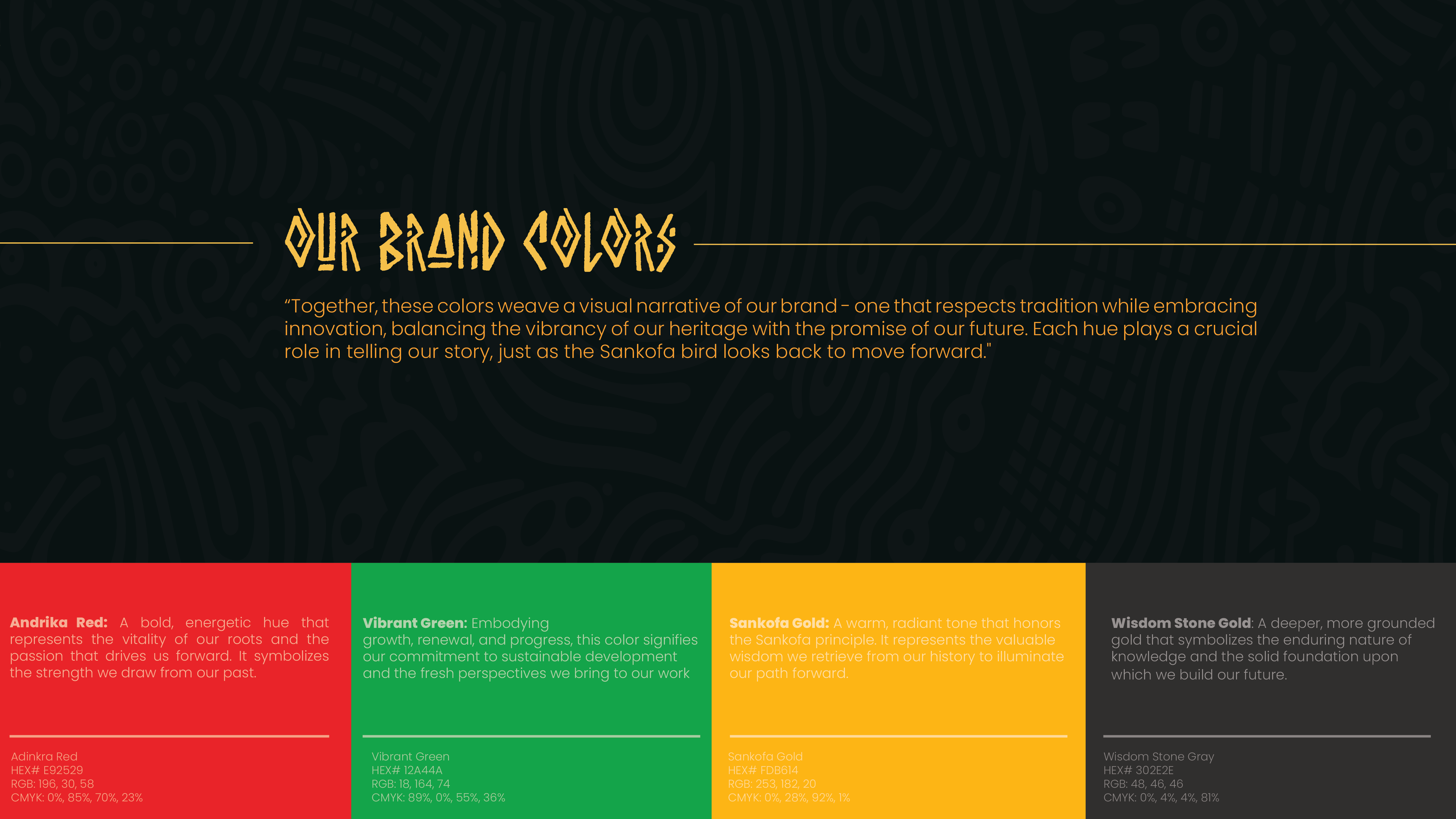
We developed a visual identity centered on the Akan symbol of the Sankofa bird, which represents learning from the past to build a stronger future. Our branding incorporates this powerful imagery along with a carefully chosen color palette that evokes heritage, progress, and inclusivity. The design seamlessly blends historical references with forward-thinking motifs, reflecting the project's dual focus on past contributions and future innovations.
Significance:
This project is significant in several ways:For the University of Michigan: It provides a unique approach to engineering education that emphasizes social consciousness and historical context.
For engineering students: It offers a more inclusive perspective on the field's history and future, potentially attracting a more diverse group of students to engineering.
For the engineering profession: By highlighting overlooked contributions of African Americans, it enriches the understanding of engineering's development and inspires more inclusive innovation.
For society: It contributes to a more accurate and complete narrative of American technological development, promoting greater inclusivity and understanding.
For this point in time: As discussions about racial equity and inclusion are at the forefront of many institutions, this project provides a tangible way to address these issues within the context of engineering education and practice.
Our visual identity serves as a powerful tool for raising awareness, fostering engagement, and promoting the vital message of The Sankofa Project in the engineering community and beyond, ultimately contributing to the development of more socially conscious engineers equipped to address complex global challenges with a comprehensive understanding of history and diversity.

Patience Walton
As a creative director in Arizona, this year has been pivotal in my exploration of blending instructional design with graphic design practices. I've focused on creating visually compelling materials that not only look great but also effectively facilitate learning and understanding. By merging these two disciplines, I've seen how we can enhance information retention and engagement across various projects. This approach has proven particularly valuable in our increasingly digital and remote world, where clear, visually-driven instruction is more important than ever. Looking ahead, I believe this intersection of instructional and graphic design will play a crucial role in shaping how we communicate complex ideas. It's an exciting frontier that combines aesthetics with cognitive science, pushing the boundaries of what design can achieve. To the future: Let's remember that great design isn't just about visual appeal—it's about effectively conveying information and facilitating understanding. By continuing to blend disciplines and approaches, we can create more impactful, meaningful work that truly serves our audience's needs.