Simple Machine Brewing Company label suite
by Aaron Thomason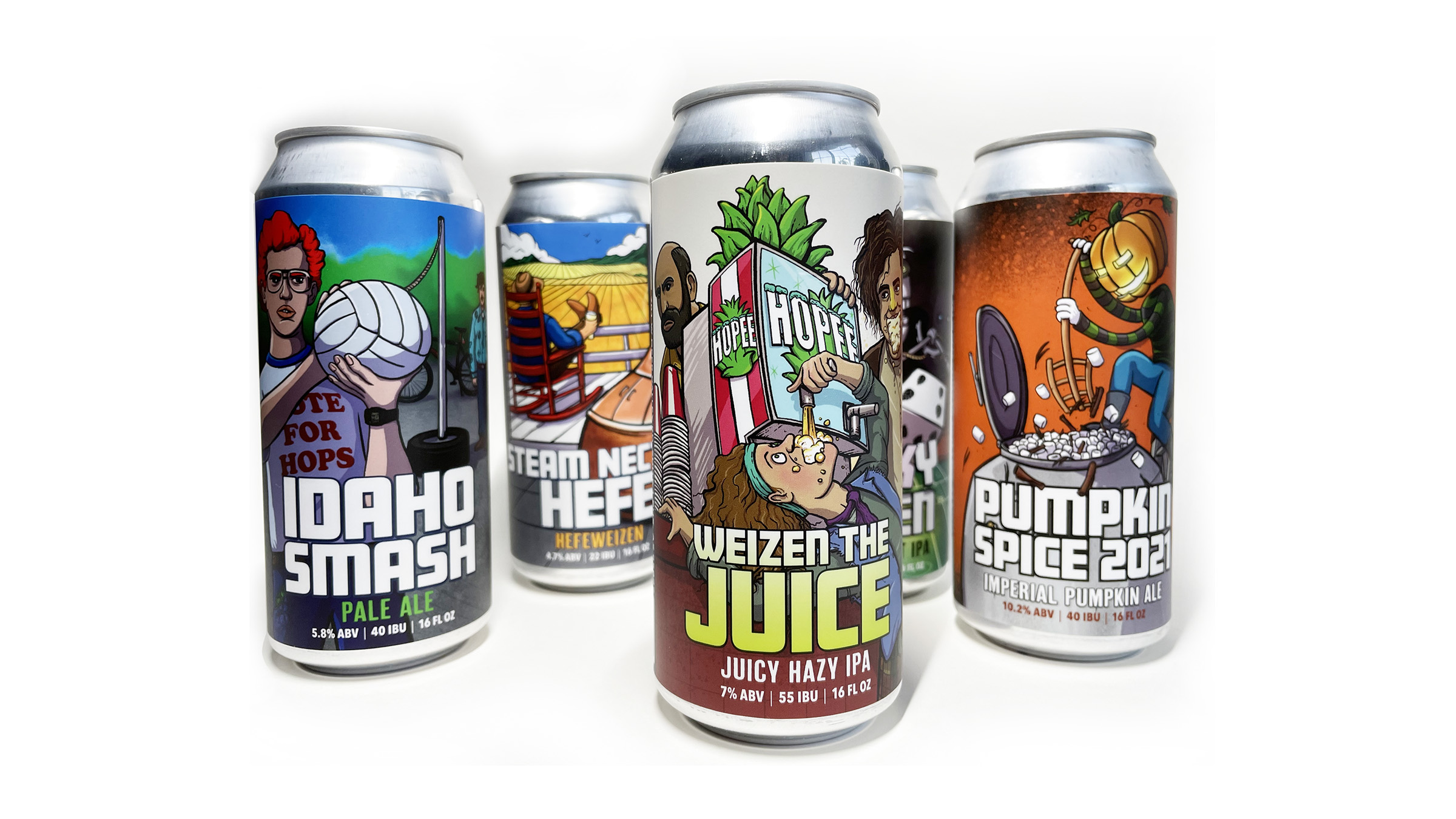
title
Simple Machine Brewing Company label suite
agency
Thomason Design
Submission by
Aaron Thomason
Project Lead
Aaron Thomason / Aaron Thomason
Contributors
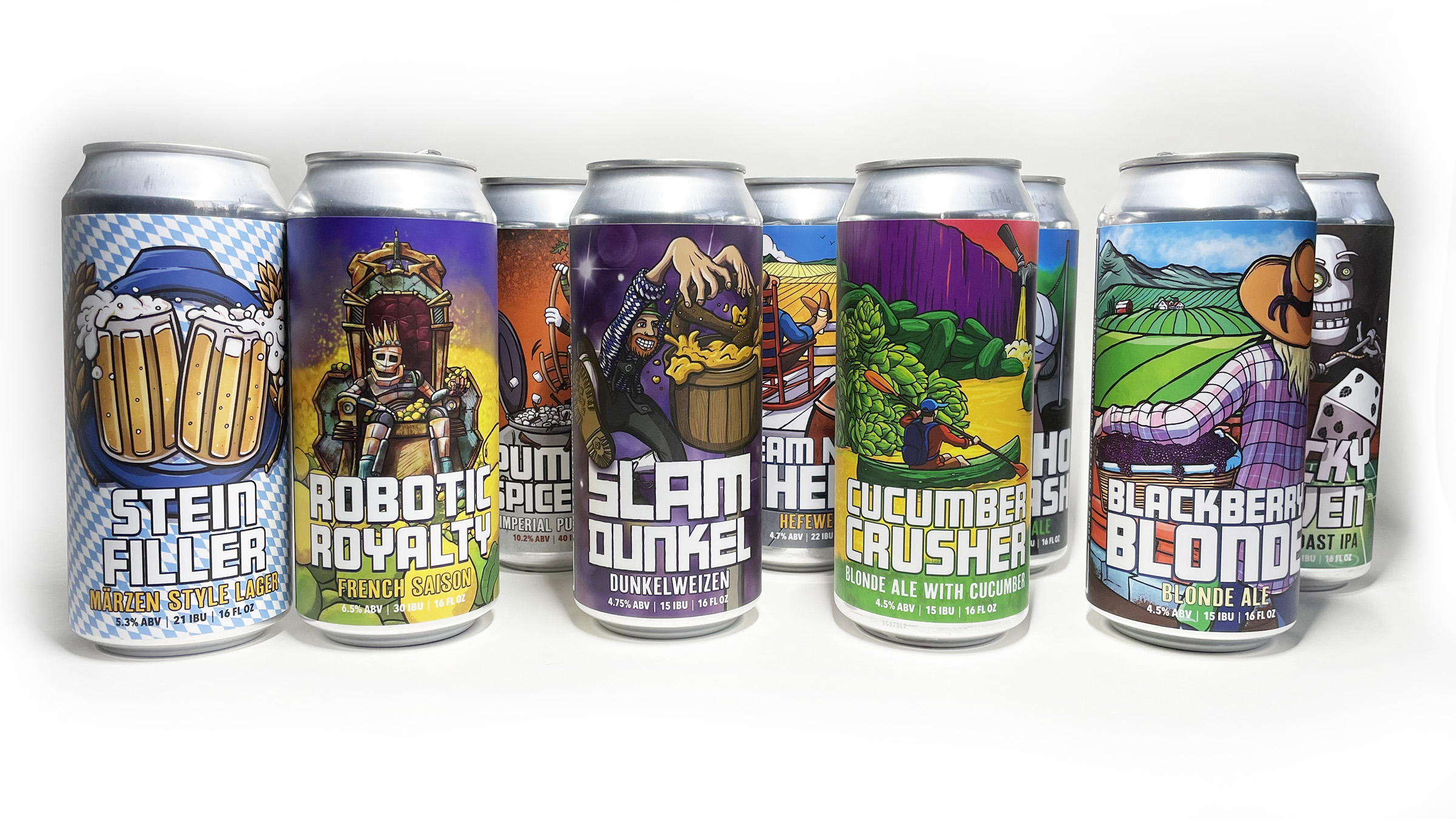
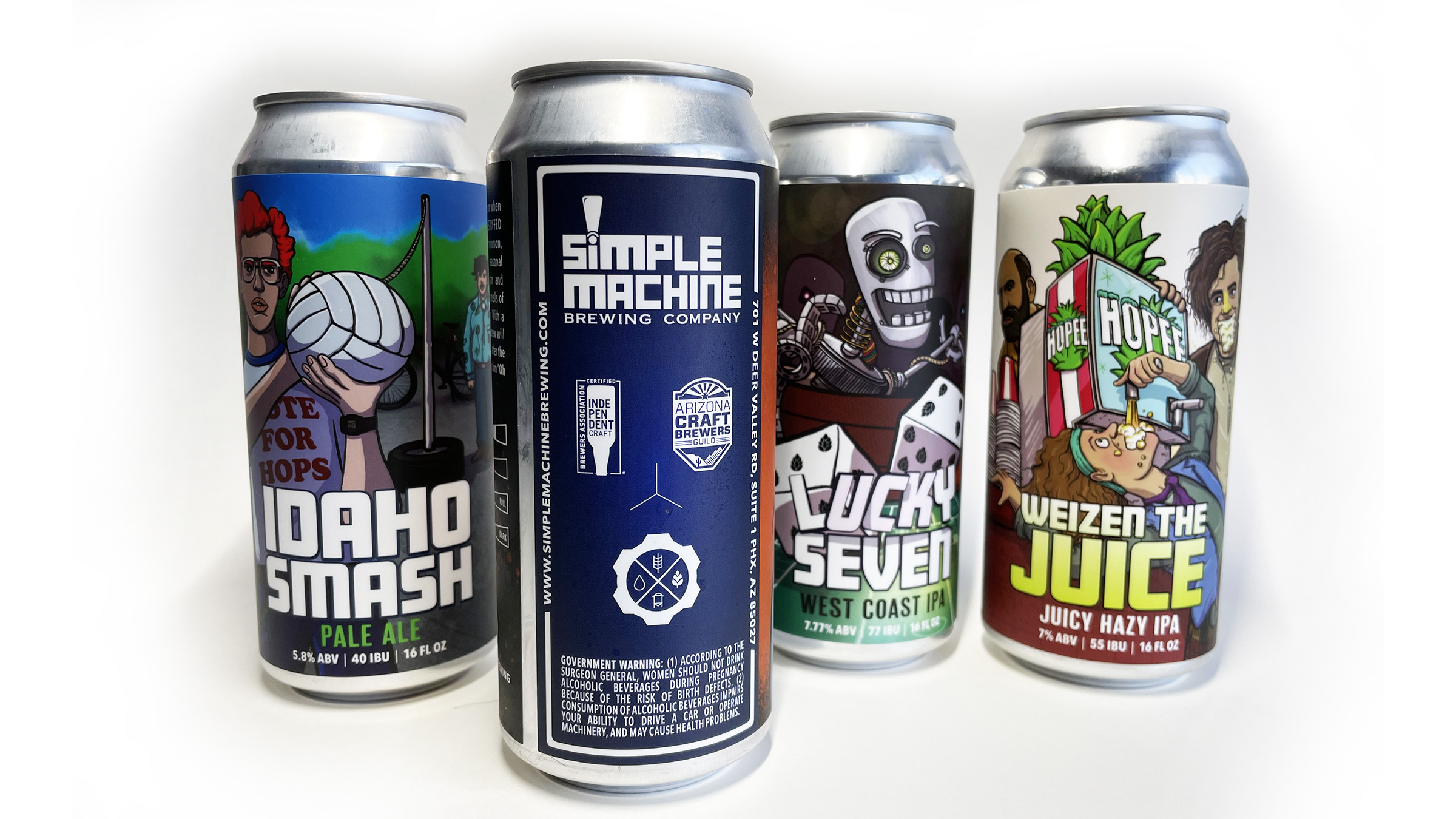
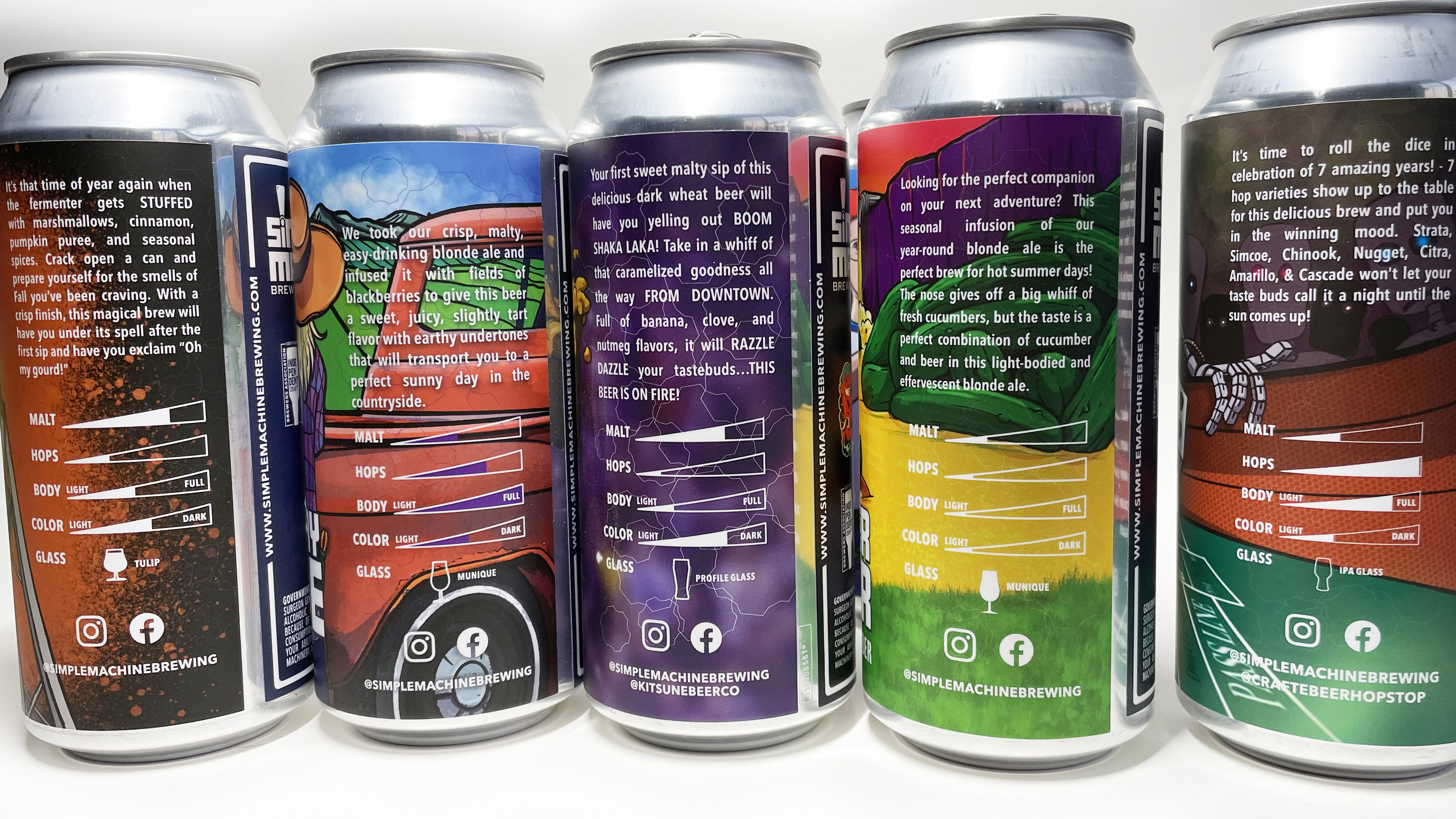
When I first started working with Simple Machine, they had a logo, but no cohesive look for their new packaging, so we were essentially starting to build a brand from the ground floor up. They were very cool and just told me to have fun with the label, so I took their suggestions and blew it up using a big, bold illustrative style to reflect the heft of their existing logo. The initial label for Helical Haze was such a success that we turned the artwork into stickers and t-shirts and the relationship was born. Since then, with each label we've been working on defining the style a little bit more, determining what's flexible (in the case of collaborations with other breweries or organizations) and what stays as part of the Simple Machine Brand. All in all a designer couldn't ask for a better client.
I always say, when it comes to clients, beer people are the best people!