District 8 Brand Identity + Packaging + UX
by Lindsay Masten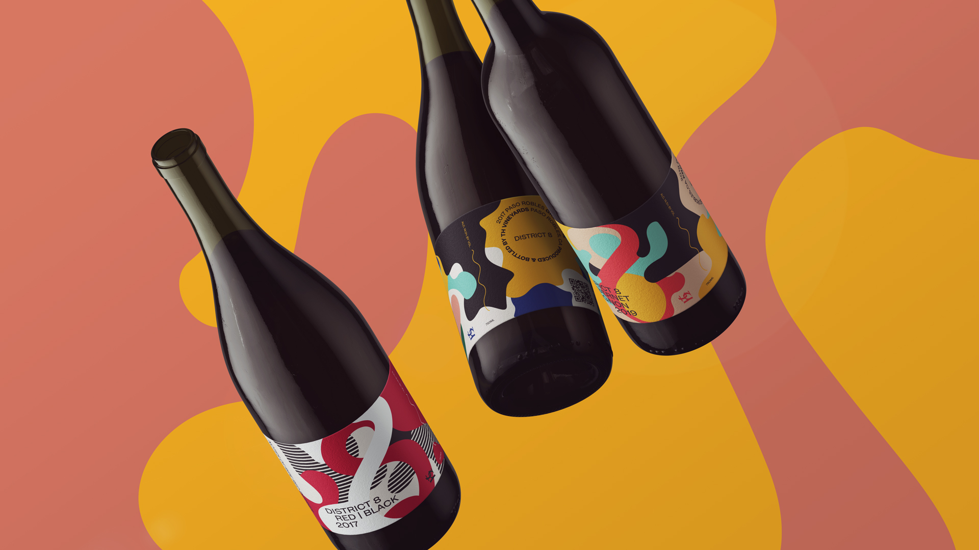
title
District 8 Brand Identity + Packaging + UX
agency
Web & Wolf
client
District 8
Submission by
Lindsay Masten
Project Lead
Lindsay Masten / Creative Director
Contributors
Kim Webster, Project Manager Bec Asmar, Art Director Linsie Decker, Copywriter Rachel Beam, UX Designer Ryan Lopez, Wine DTC Consultant
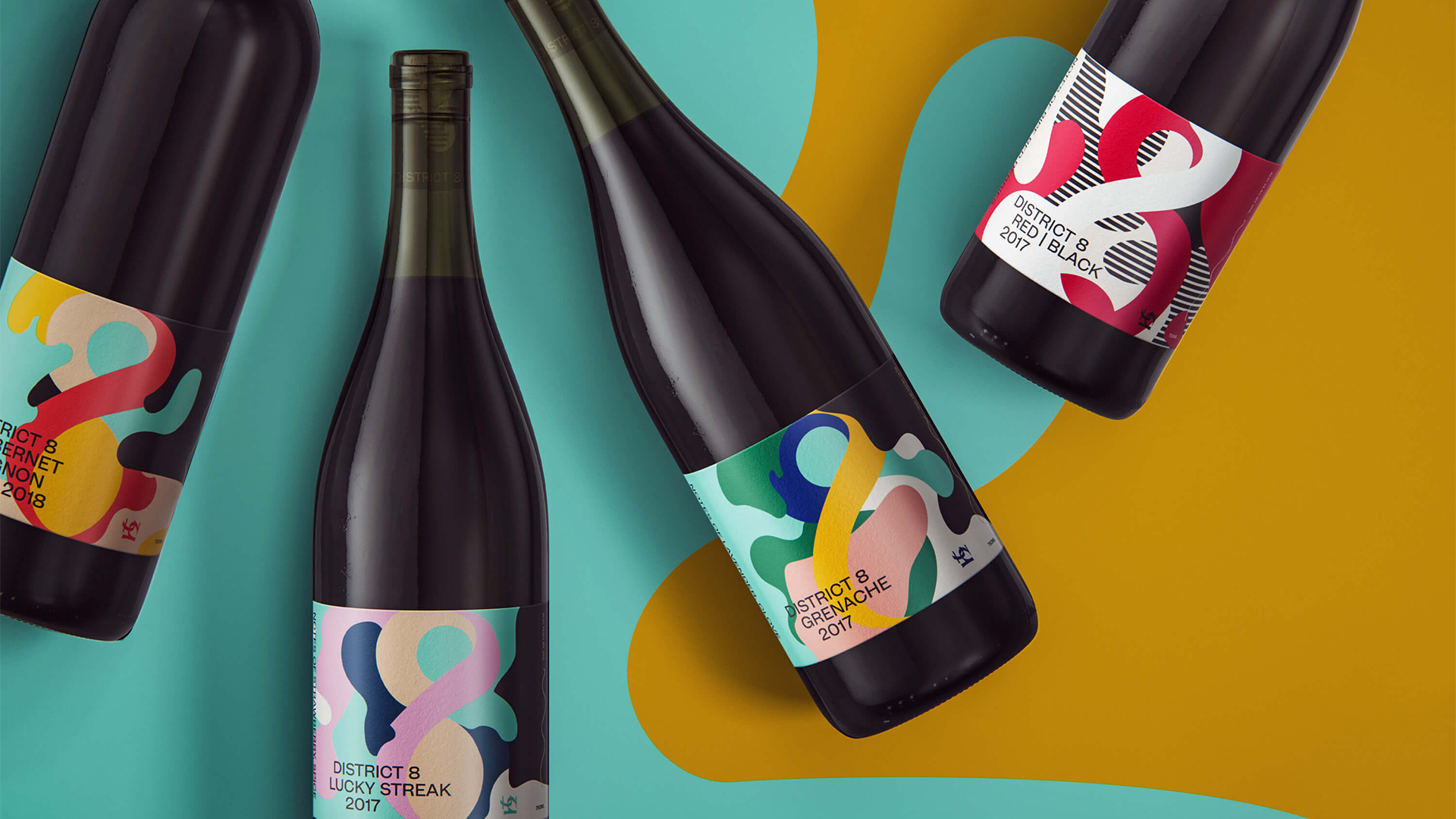
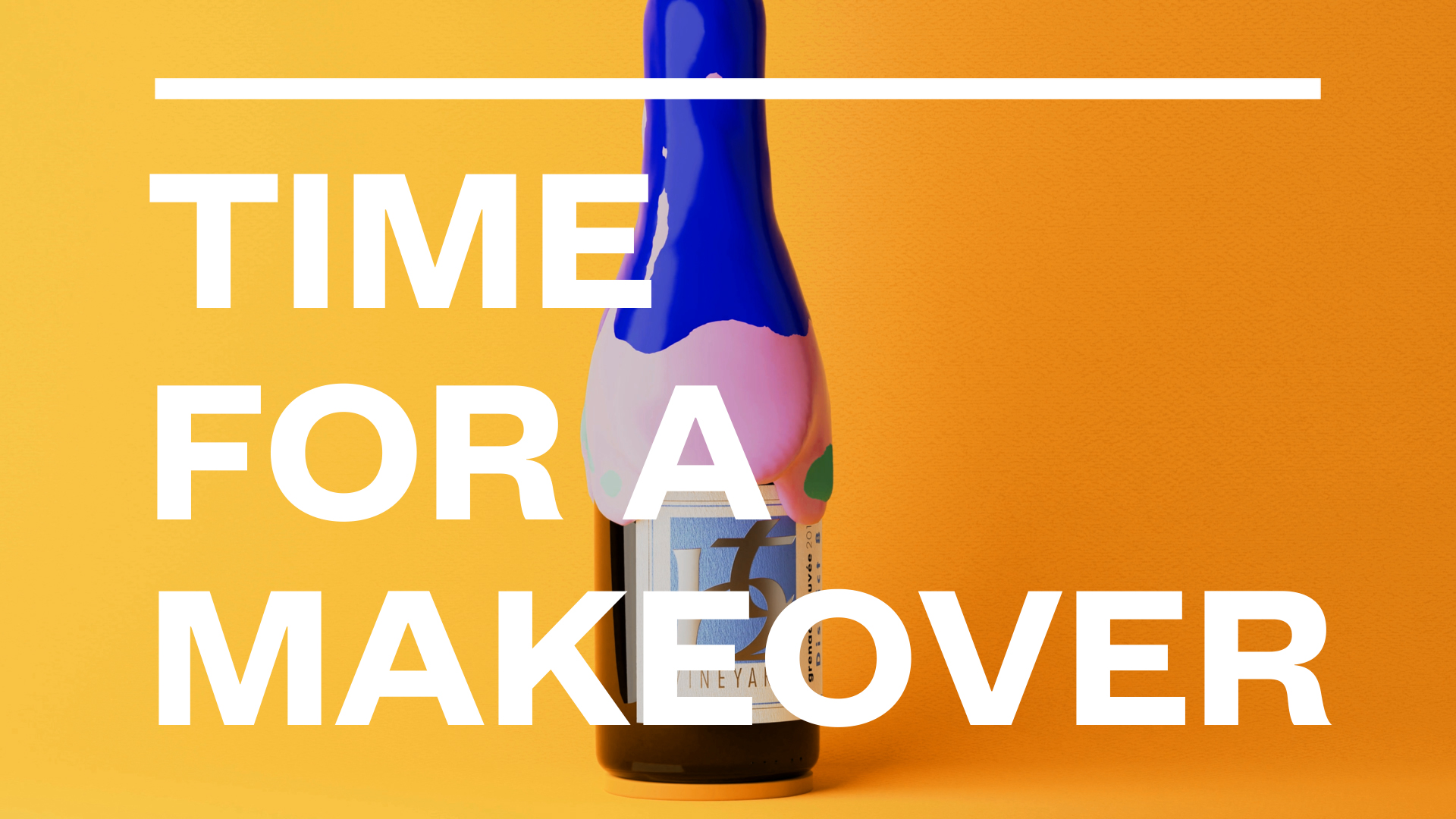
District 8 is an experimental wine project from one of our favorite winery clients, TH Estate Wines in Paso Robles, California. The ethos of District 8 is an exploration of California's 8th wine district, a growing region that spans San Luis Obispo and Santa Barbara counties.
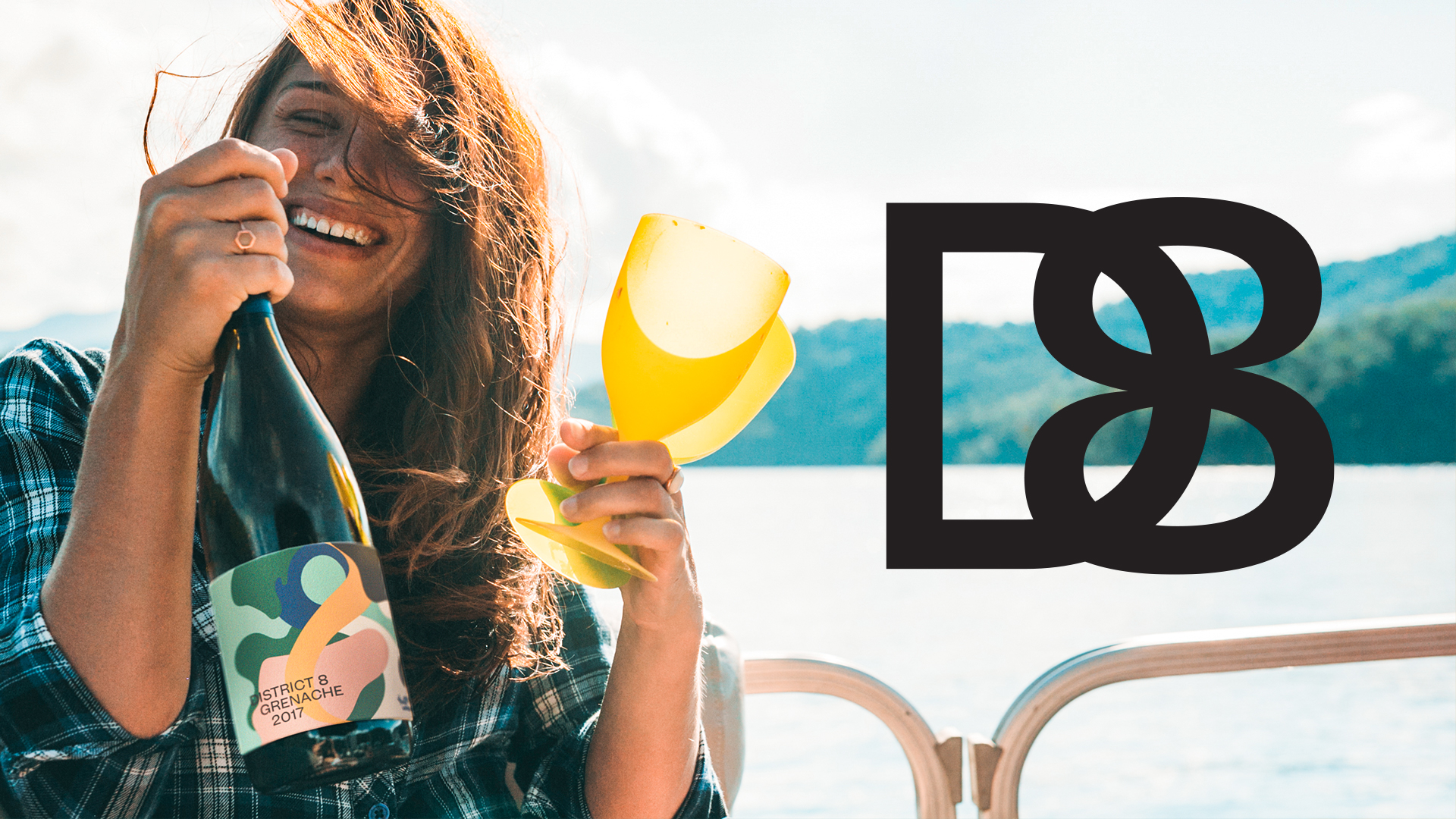
The brief, in a nutshell, said they had a wine label they'd been selling for some time that they now wanted to expand into an entirely new brand. A brand for unstuffy people who are still into fine, fine wines but want to enjoy them at a tailgate, instead of a tasting room.
In some ways this project was a redesign; the animation we created for District 8's social media highlights this. To one set of consumers, who'd been drinking TH Estates' District 8 wine already, we presented a wine bottle makeover.
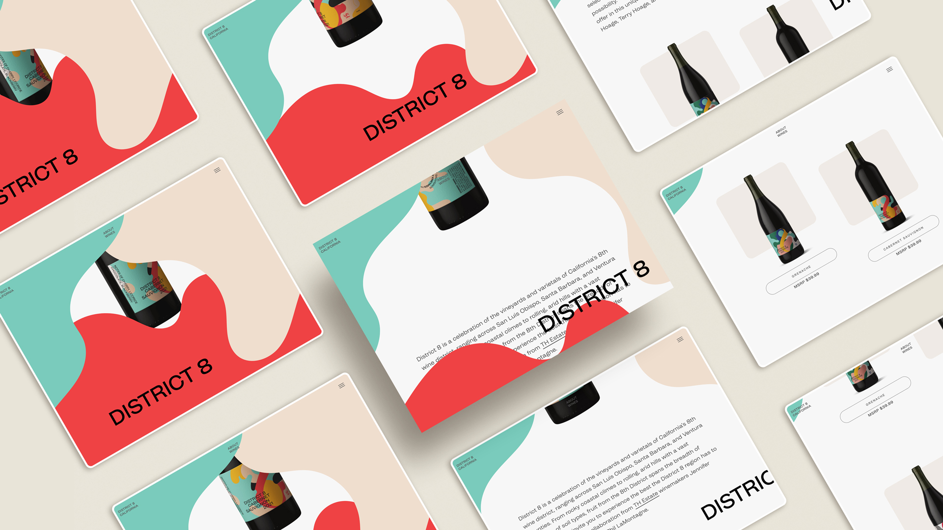
In other ways, this was a brand launch from scratch. What was once a single SKU became a line of wines designed to work in concert, grabbing attention on the shelf. And it had a budget that precluded lots of special finishing often seen in the alcohol world. So we worked within the constraints: creating a flowing, graphic, and bold visual language that worked without foil stamping, embossing, or even a capsule. We also designed each labels' shapes to flow seamlessly into one another, so that when seen as a set, distinct colors could call out each SKU without pulling it out of the family.
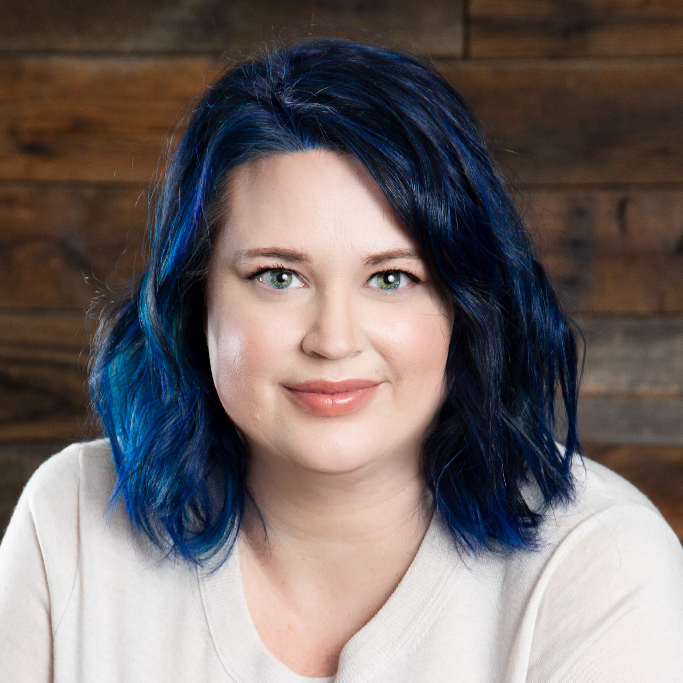
Lindsay Masten
When I first moved to Arizona from California—stop hissing—in 2018, I worried that I'd be alone, creating in my home office and slowly becoming one with my chair. What I've found though, is that Arizona is ripe with creative community. I discovered much of this creativity last year, when I volunteered for Phoenix Design Week. While I couldn't volunteer this year, I haven't forgotten the people I met and the excellent work I saw. I don't know if this is much of an anecdote, but I hope that my work, and the agency where I'm a partner, will will fit in this world of determined, desert creativity.