OVA Typeface
by Tori Whitcomb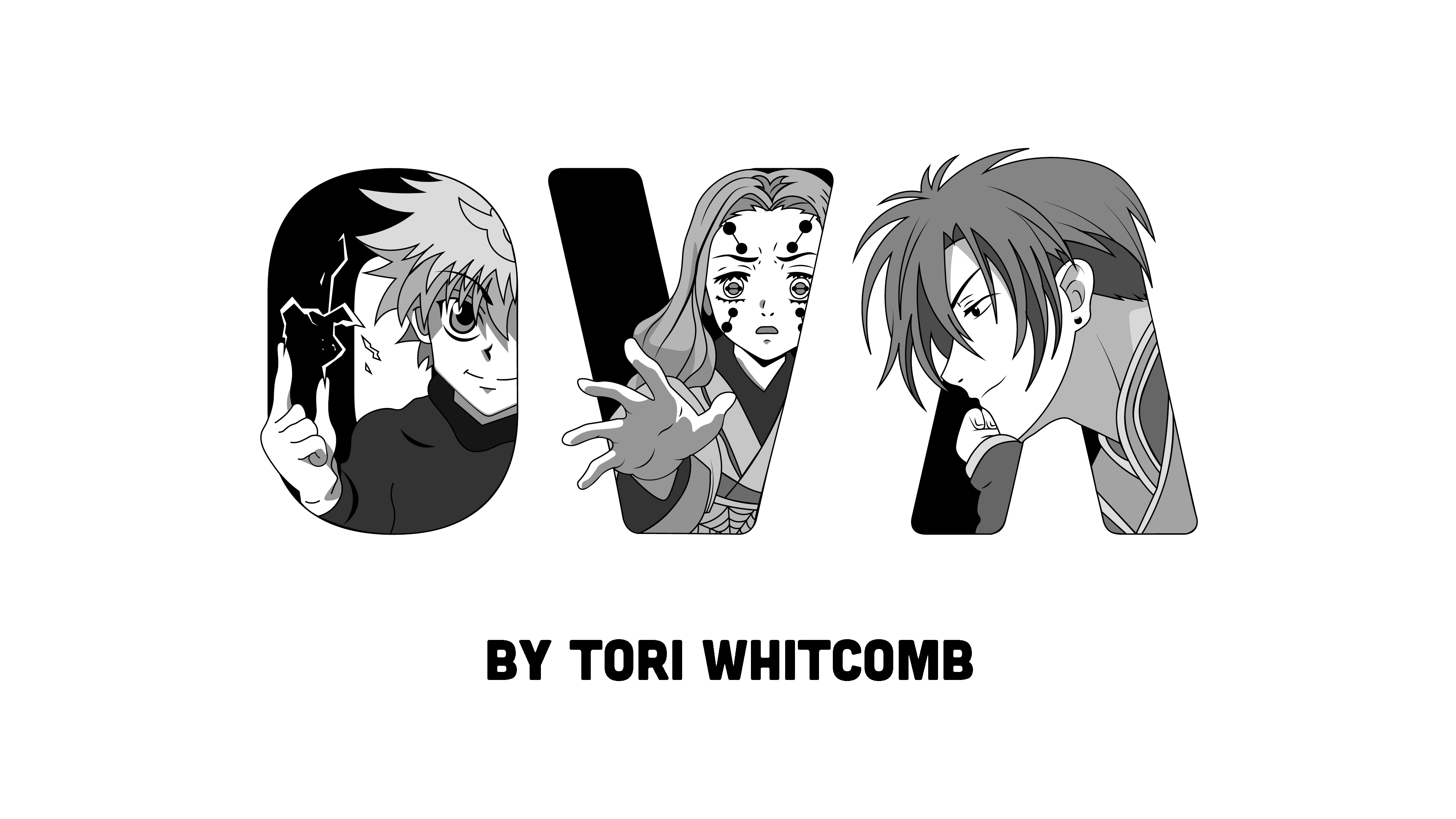
title
OVA Typeface
agency
Tori Whitcomb
client
Tori Whitcomb
Submission by
Tori Whitcomb
Project Lead
Denisse Montoya / Project Lead
Contributors
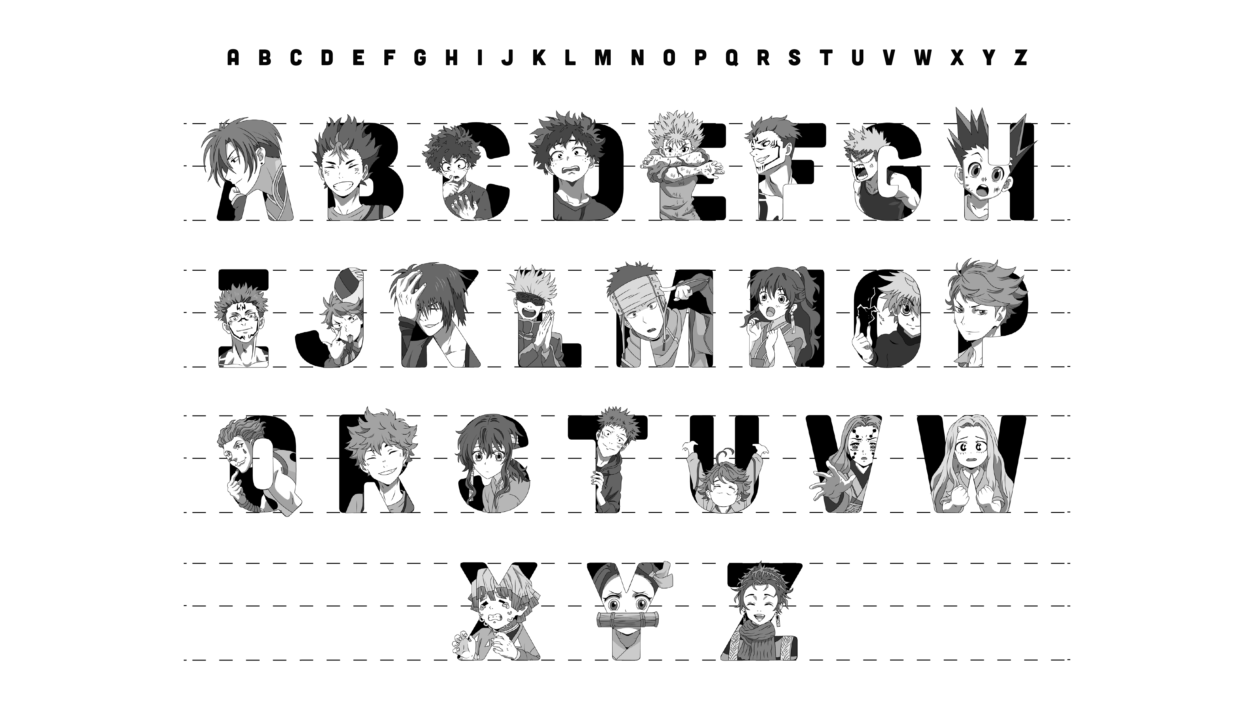
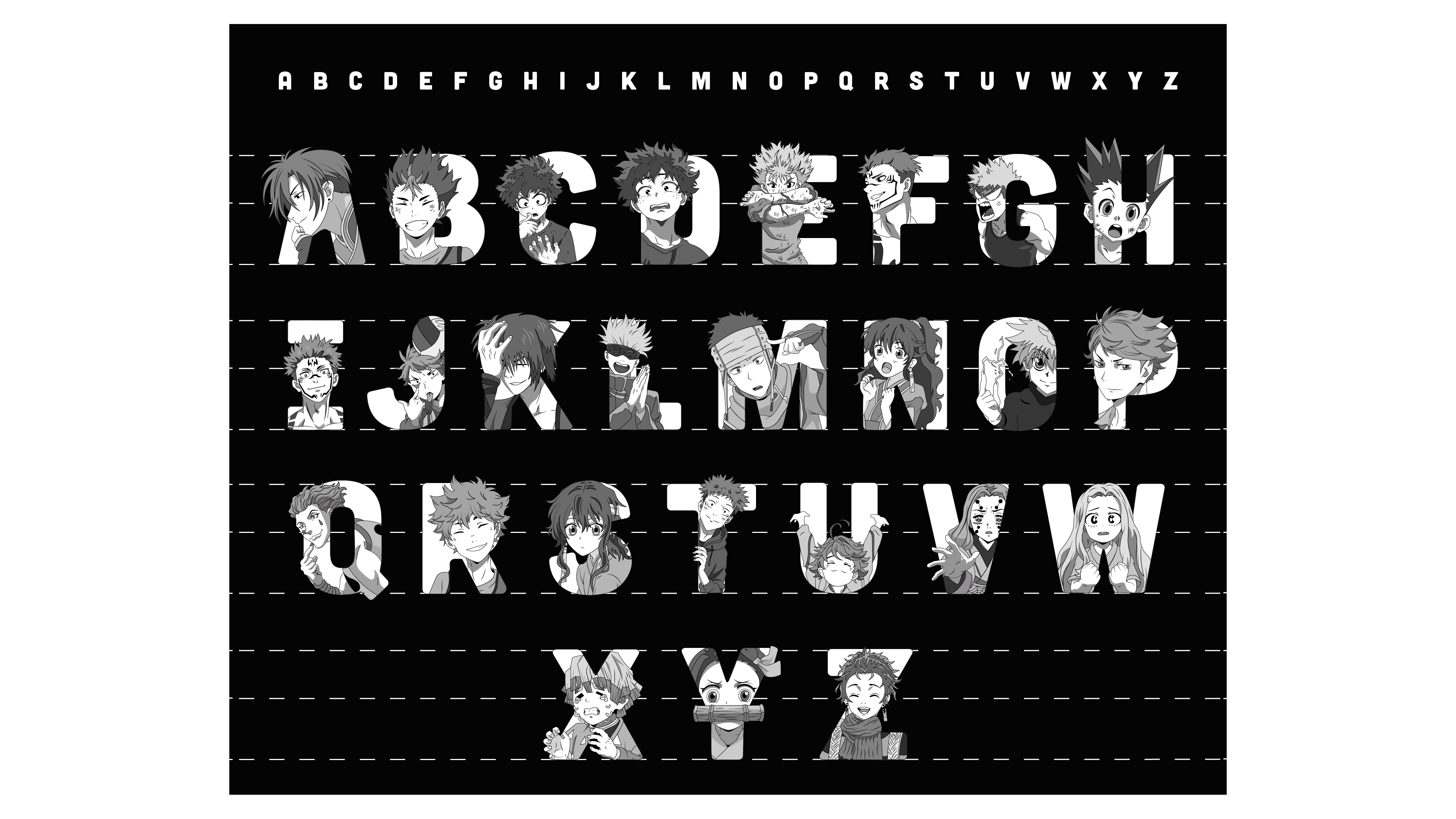
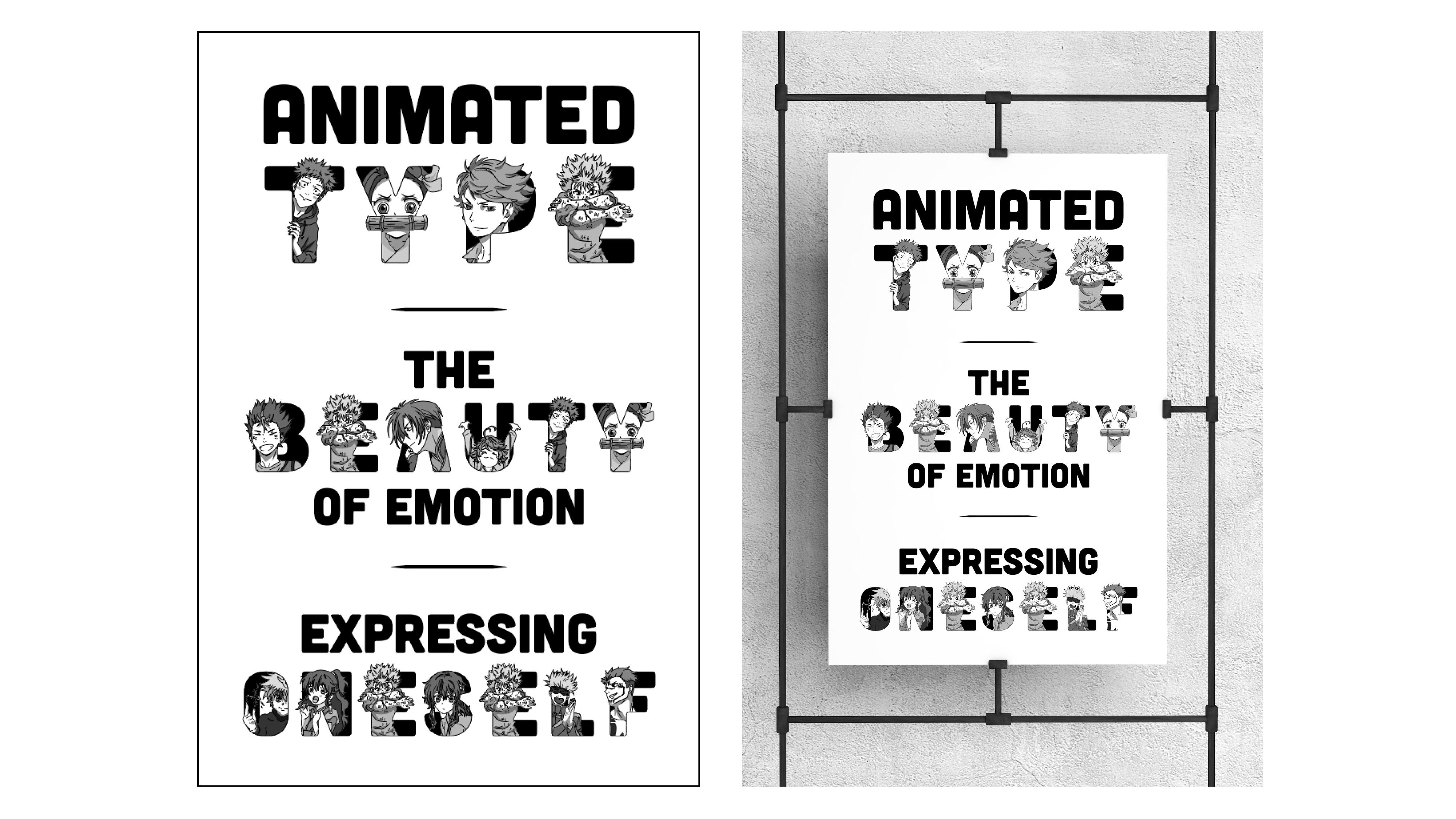
The typeface I created is called OVA. In the anime culture, episodes that are created separately from the main storyline of the show to illustrate new sides of the characters are called OVAs. This concept mimics what I wanted to create for the typeface. I'm taking the characters, not changing looks or expressions, and presenting them in a new light. Anime has a beautiful art style, and all these shows are known for their over-dramatic emotions. They are incredibly expressive, and I wanted to show that in detail in each letter. Every letter has an emotion or word tagged with it, and the character within the letter represents that word. Sometimes, the anime culture is looked down upon, and I wanted this project to bring light to its detailed beauty.

Tori Whitcomb
I’m originally from Colorado and moving to Phoenix has been one of my favorite decisions, especially since I wanted to pursue a career in graphic design. The design community in Phoenix is fast-paced, competitive, full of opportunities, and most importantly, has some of the most kindhearted people I’ve ever met. It’s encouraging to be surrounded by people that love design just like me, and everyone embraces your style or passions. One of my passions is anime and illustrating the characters. I’ve always hidden that part of me, but through this typeface project and the loving designers around me, I was able to express that side of me in a very detailed project.