Golden Typeface
by Holly Emerson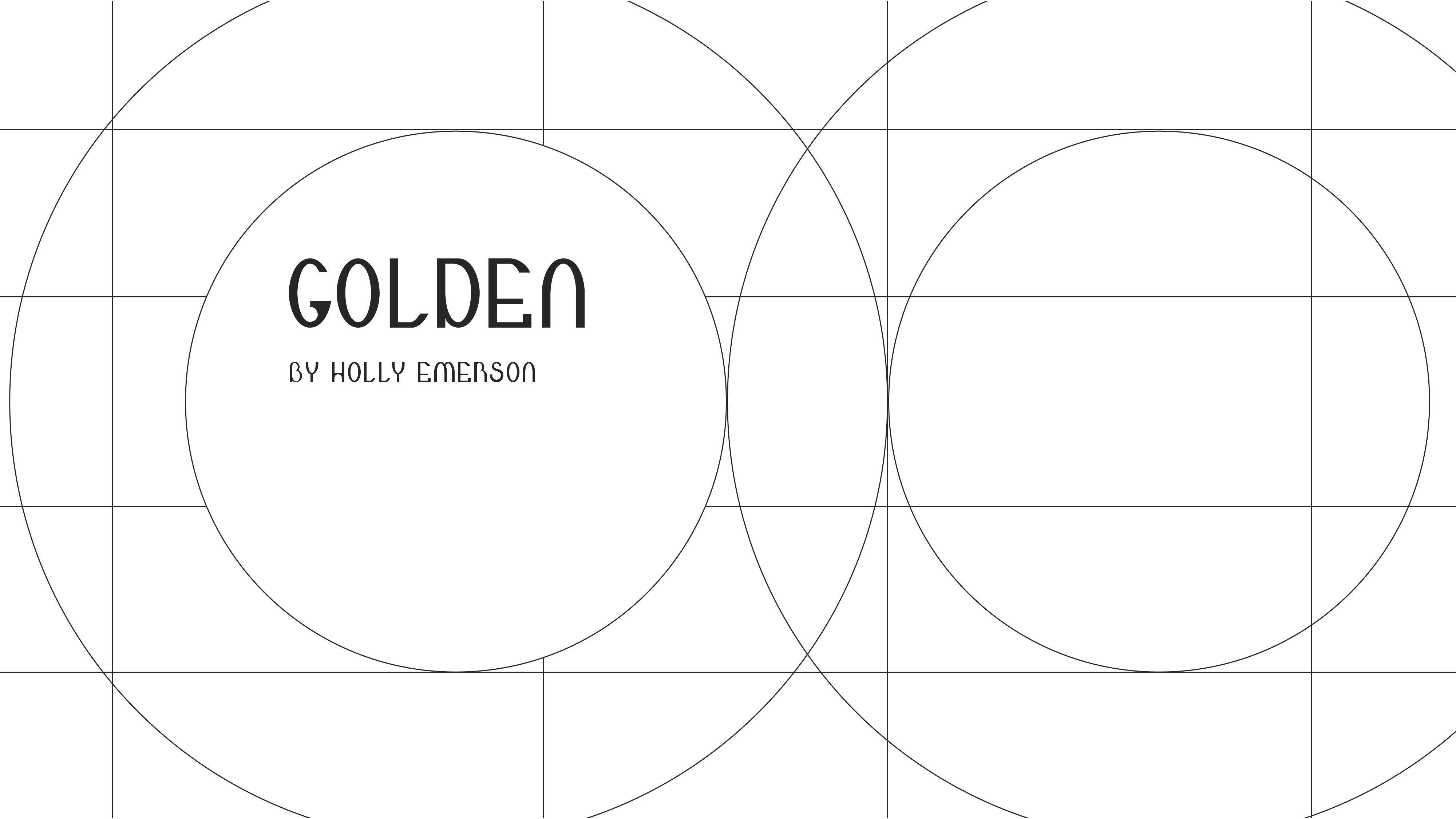
title
Golden Typeface
agency
Holly Emerson
client
Holly Emerson
Submission by
Holly Emerson
Project Lead
Denisse Montoya / Project Lead
Contributors
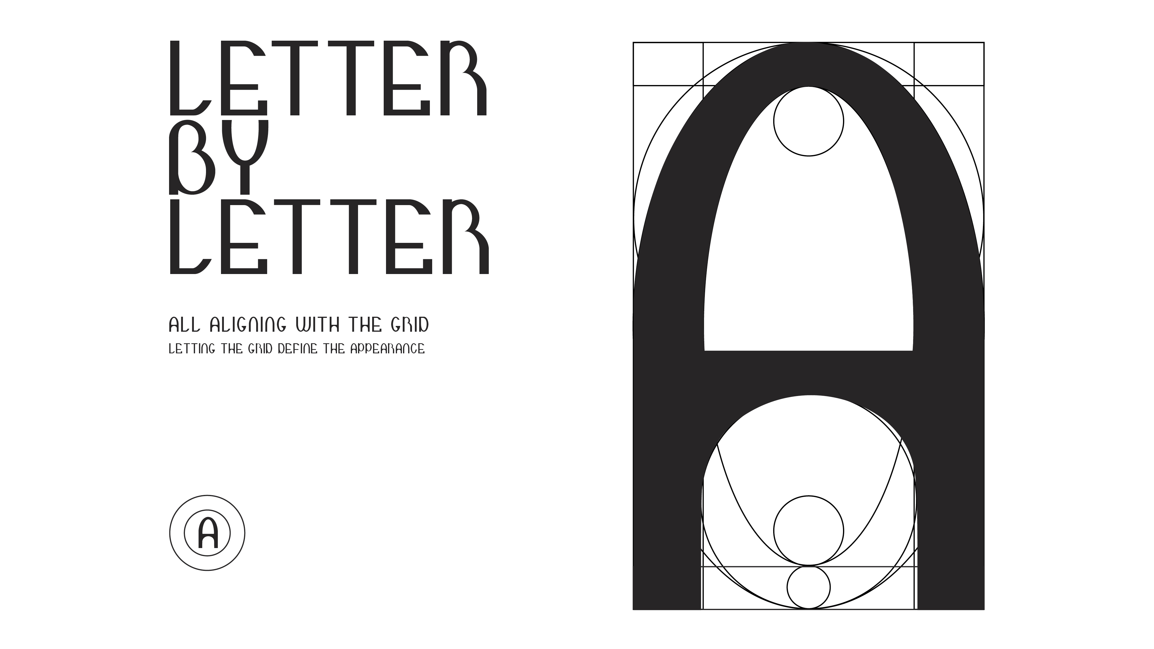
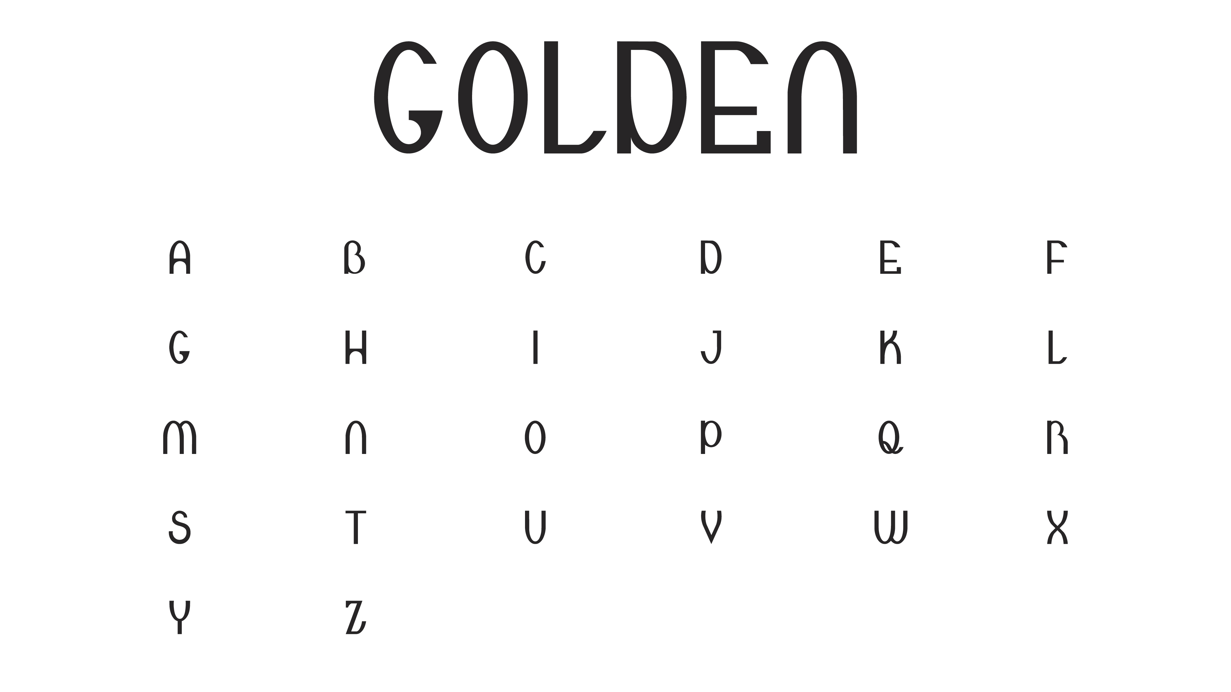
There is an innate balance of visual beauty and structure found in nature. The golden ratio is at the core of this concept and can be seen logically in math and visually in design. This typeface is a product of what letters look like when built from a grid based on the divine ratio. My favorite thing about this project is that this is only one version of this concept because the letters are derived from only one grid. Many grids can be generated by the golden ratio. Please enjoy this one sliver of design built on math and proportion.

Holly Emerson
Have you ever found yourself thinking that everyday design is underrated? My experience going from school to being a full-time freelance designer working at a local company specializing in direct mail advertising has taught me this – I believe there is a need for designers who are in the spotlight on big projects and there is also a need for detail, hierarchy, alignment, storytelling, and color in visuals going to a specific person from a specific company. A coworker recently told me that a designer's job is to make the imagination of the client visible. What a beautiful profession that we can thrive in together here in Arizona. We make communication beautiful and fundamentally intact in big and small projects because the truth is that each project will be seen by someone. And each person is worth investing the time to create great design.